Tuesday, October 30, 2012

Using Photoshop's Gradient layer

This one is for Julie, from my Facebook group.  Julie wanted to remove the distracting bright orange toy from this photo, and was having trouble cloning it out.


Now, let's be clear - cloning definitely is the "correct" way to do this.  It could be done with some patience, using this method.  But when I asked Julie if she'd be happy with the "lazy solution" (my area of expertise!!!) she said yes.

So, here we go, Julie.  I did this in Photoshop CS2, but it'll work in all versions of Photoshop and Elements as far back as I can remember.  This method uses the Gradient layer, which I've discussed a little in other tutes, particularly regarding skies.

First, I used the Lasso Tool to roughly select the background:


Saturday, September 29, 2012

Resetting tools

Sometimes, just occasionally, one of your tools will start misbehaving in Photoshop.  It might be the Text Tool which is putting enormous spacing between letters and you don't know why; or it might be the Crop Tool which keeps cropping to a fixed shape even though you've got no values in the Options Bar; or it might be the Clone Stamp Tool which won't sample the right colours ... or whatever.  You know, any one of those annoying little glitches that can happen with any software, any time.

If you're lucky, the problem can be fixed by simply resetting the tool.  You do this via the little "Tool Preset Picker" at the left end of the Options Bar, then going to the submenu, and choosing "Reset Tool":


This won't solve every Photoshop problem you ever have, but it's an important little troubleshooting device to have up your sleeve.

Tuesday, September 4, 2012

What is "clean processing"?

"Clean processing" is a term you'll see frequently on photographic forums, and especially in my Facebook group.  To a degree, everyone has their own interpretation of the concept, but maybe it's new to you.

In a nutshell, a clean-processed image is one to which it's not obvious that any editing has been performed (even if it has).  The kind of image that makes somebody say "Wow, you're a good photographer!", rather than "Gee, you're good at Photoshop!".

A clean-processed photo has no particular effect or style applied, and as such, it should sit as comfortably in your portfolio in five or ten years' time as it does today.  However, it does provide the basis of all other editing styles.  Consistent clean processing means consistent and predictable results from your artistic editing, especially if you use actions or presets.

Of course, even within the narrow description of "clean", there is room for personal interpretation.  You may prefer your images warmer or cooler, or brighter or darker, or richer or paler, than the next person.  But in general terms, a "clean" image is one where the whites are white, the blacks are black, and the grays are gray.

Is it quick?

Maybe, maybe not.  It depends on how good the original photo was.  Clean processing might take a few seconds, or a whole hour.  The point is, nobody can tell.

Friday, August 24, 2012

ColorMunki Create - thumbs down

A recent addition to the monitor calibration market is the Pantone ColorMunki Create.

In reality it's an X-Rite device, like all the other ColorMunkis, but it's badged by Pantone and sold as part of a "professional colour creation solution" package, which apparently enables you to choose sets of colours, build colour palettes ... blah, blah, blah, I don't know.  I didn't look into that stuff.

I bought it because I wanted to see if it's a viable option for people seeking a low-cost monitor calibrator.  And I'm sorry to say it isn't.  It gives even fewer calibration controls than the Spyder Express, and that's really saying something, because the Express gives you very little control.

So, my advice remains the same as it has for a while now.  The bare minimum device for anyone serious about their monitor calibration is the X-Rite ColorMunki Display; and anyone who is more than average serious about it should go for the X-Rite i1Display Pro.

However, having said all that, I will (when I get a chance) be writing a tutorial for the use of the ColorMunki Create, for anyone who has one.  It'll be included with the other calibration instructions on my website.

As always, if you have any questions about monitor calibration, or anything else, please visit me at Ask Damien.

Note: This device is also marketed as the ColorMunki Smile.  Again, it'll give you no reason to smile at all.

Monday, June 11, 2012

Case study: Bright red clothing

Thanks to Chasity from Ohio for allowing me to use this gorgeous photo in this post.

This article relates to my previous Strategies for managing out-of-gamut clothing post, which I suggest you read first if you haven't done so already.

Red clothing is a hassle, isn't it.  Well, any vivid-coloured clothing can be, but red seems to plague us most often.  Check out this photo.  That red outfit is as cute as all get-out, and so wonderfully bright!  It makes you swoon (although it also burns a cyan imprint on your retina if you look at it for too long!!!).


But there are two problems.  Inter-related problems, but different.

Saturday, May 19, 2012

Free texture files - old leather

When you keep your pommel horse in your back yard ...


... its leather inevitably starts to deteriorate.  I was looking at it today (thinking about re-covering with all-weather canvas) and I realised that the old leather is as charismatic as anything!

Well, I couldn't pass up such a great opportunity to add to my texture library, so I borrowed my wife's camera, with the macro lens, and grabbed a bunch of photos.  Needless to say, my complete lack of photographic skill resulted in fewer than one in five of the photos being usable, but still, I ended up with eight keepers.

Monday, May 7, 2012

Create your own wall guides

Thanks to Crystal for asking this great question.

Recently I wrote a tutorial about preparing an image for canvas printing.  But before you prepare it, you've got to choose it, and its size.  The latter is really important - it's easy to think that a print size (eg 20x30") is really big, but in fact it's very small once it's on your wall.

So, the best way to choose a photo and an appropriate size is to see it on your wall first.  And it's very easy to do.  First, take a photo of the wall on which you'd like to hang the print.  Here's an example wall:


To make it simple for yourself, don't photograph the wall at an angle.  Stand perpendicular to it to take the shot.  This tutorial can be adapted (sort of) for an angled photo, but it won't be as easy, or as accurate.

Saturday, April 14, 2012

Cloning in the workflow

All editing can loosely be divided into two categories.  In one category are colour and tonal adjustments, using Curves or Levels or Hue/Saturation or Photo Filters or whatever.  These edits change the appearance of the pixels in the image, and are done with adjustment layers and masks.

In the other category are pixel edits.  These edits actually change the pixels themselves (by moving or copying or blurring or hiding them), and can't be done using adjustment layers - they must be performed directly to the pixels.

In this "pixel editing" category, we find:
  • Noise reduction
  • Liquifying
  • Skin smoothing
  • Cloning
  • Healing

Thursday, March 22, 2012

Opacity shortcuts

There are about a bazillion keyboard shortcuts in Photoshop and Elements, and you can't learn them all at once.

At first, focus your attention on the most important ones in the toolbar - C for the Crop Tool, B for the Brush Tool, V for the Move Tool, etc.  Those are the ones that you'll use frequently, and therefore they'll save you the most time.

Once you've mastered those, you should aim to gradually add more shortcuts to your subconscious arsenal.  Every time you can press a key instead of moving your mouse to a tool/menu/slider, you've saved yourself a second or two.  And even though a second or two doesn't seem like much, a lot of little time savings can seriously add up to a faster workflow.

I want to tell you about the keyboard shortcuts that have saved me the most time - brush opacity.

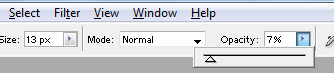
Changing the opacity of your brush is a tedious thing to do with the mouse.  It's not just one click, it's two or three.  You have to reach up to the toolbar, click for the slider to appear, then slide it; or click to highlight the numeric value, then type a new one in.  Seconds wasted!


Embrace the shortcuts, my friends.  They're staggeringly simple - just press 1 for 10%, 2 for 20%, 3 for 30% etc.  That's all!  Just a single keystroke will change the brush opacity, and you barely have to pause painting to do it.

Most importantly, press 0 to put it back to 100%.

If you want a more precise value, type two digits.  Type 25 for 25%, or 03 for 3%, etc.

Try it and see!  It's great.  It also works for the Clone Tool, and other brush-related tools.

Word of warning, though.  If you happen to have a non-brush-related tool selected (such as the Move Tool, or the Crop Tool, or whatever), and you press a number, it'll change the opacity of the layer instead.  Watch out for that little trap - it's caught me many times!

Tuesday, March 20, 2012

Dealing with "hot" areas of skin

This is a very simple tutorial that I've been meaning to write for ages.

Many thanks to Nicole of Essence of the Soul Photography for allowing me to use this beautiful photo:


So gorgeous!  But it has a little problem that seems to pop up in quite a lot of photos ... it has some areas of very "hot" skin - that is, the skin is glowing quite bright red in some parts:


This problem almost always occurs in shadowy areas of skin.  Sometimes it's caused by a red cast - perhaps the subject is wearing a red shirt, or standing beside a red car, or whatever.

Comments or Questions?

If you have anything to add or ask about this article, please visit me at my Ask Damien page.