Once you've calibrated your monitor with a calibration device, you can check its gamut - that is, you can check the range of colour that it displays. You can compare it with the sRGB colour space, or Adobe RGB, or maybe the gamut of another calibrated monitor.
This might sound nerdy, and it is! But it can be interesting, too.
The cool way - in 3D!
If you have a Mac, this is available to you really easily, via the ColorSync Utility. You can view colour profiles in 3D, spin them around, etc. And you can compare the size and shape of two profiles. I've found some info about it
here.
If you have Windows XP, you can download and install a very similar Control Panel from
here. Just like the Mac one, it's great - you can view and compare profiles in 3D. (Unfortunately Microsoft don't seem to have continued support for this application in Windows Vista. I'm not sure about Windows 7.)
Here's a screenshot from the Windows XP Color Control Panel. It's my editing monitor (in colour) compared to the sRGB colour space (in grey). You can see that in some areas of the spectrum my monitor exceeds the sRGB gamut, but in other areas the sRGB gamut is larger:

Now here's my laptop screen being compared to sRGB. Needless to say, the cheap laptop screen has a very small gamut - much smaller than sRGB apart from a few areas:
 The boring way - in 2D :(
If you don't have a Mac, or Windows XP, then I'm not aware of any other free 3D profiling programs (that's not to say they don't exist, of course).
In that case, you can use Photoshop (not Elements, I'm afraid) to give you a visual guide to the capabilities of your screen. You can use the Soft-proofing function, along with the Gamut Warning, to indicate which colours in an image can't be properly displayed by your screen.
You could do this test with any image at all, but to really check the extremities of colour, here's a rainbow for you. It's in sRGB (but you can assign another colour space if you wish) and it represents a range of colours - the brightest ones, then some partially desaturated ones, then some quite dull ones.

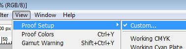
With this image (or another) open in Photoshop, choose the Custom Proof Setup from the View menu:
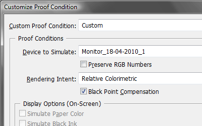
Choose your calibrated monitor profile as the soft-proof profile, turn off "Preserve RGB Numbers", and leave the Rendering Intent on "Relative":
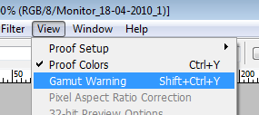
Once that's set up, choose "Gamut Warning" from the View menu:
The gamut warning puts ugly patches of grey on your image where the colours are too extreme to be shown on your monitor.
Here's the sRGB rainbow, showing the areas that can't be displayed by my editing monitor. You can see there's a patch of magentas and blues where the screen is inadequate, as well as a bit of green and yellow. This tallies with the 3D comparison I showed you above:

For kicks, I've assigned the Adobe RGB profile to the rainbow, then assessed my editing monitor's capabilities. This time, there are some serious deficiencies:
 What does all this mean?
Well, for me, it means I don't work in Adobe RGB if I can help it. You can see from the screenshot above that my monitor (despite being a fancy expensive IPS job), can't even show me all of the sRGB space, and falls badly short of the Adobe RGB space. If you read my
analogy a couple of weeks ago, you'll know that I think it's absurd to dabble in colours that you can neither see nor reproduce.
I encourage everyone who is grappling with the colour space debate to try this test. If you find that your monitor can't even adequately encompass the sRGB space, it's futile and dangerous to work in Adobe RGB.
 Choose your calibrated monitor profile as the soft-proof profile, turn off "Preserve RGB Numbers", and leave the Rendering Intent on "Relative":
 Once that's set up, choose "Gamut Warning" from the View menu:
 The gamut warning puts ugly patches of grey on your image where the colours are too extreme to be shown on your monitor.
Here's the sRGB rainbow, showing the areas that can't be displayed by my editing monitor. You can see there's a patch of magentas and blues where the screen is inadequate, as well as a bit of green and yellow. This tallies with the 3D comparison I showed you above:
The gamut warning puts ugly patches of grey on your image where the colours are too extreme to be shown on your monitor.
Here's the sRGB rainbow, showing the areas that can't be displayed by my editing monitor. You can see there's a patch of magentas and blues where the screen is inadequate, as well as a bit of green and yellow. This tallies with the 3D comparison I showed you above: