Thursday, September 23, 2010
Bit depth ... explained by cake
In conversation today I was asked to explain 8-bit vs 16-bit.
Let me say at the outset that I'm on a no-sugar diet, so I'm craving cake! I can't stop thinking about cake. Mmmm ... cake ... Folk who know me know I can explain most things with cake analogies, and bit depth is no different. Here goes ...
The purpose of editing in 16-bit is to completely negate the risk of visible degradation during pixel editing. You'll be most familiar with this degradation as "banding" - where large areas of similar detail "break up" and leave visible blockiness after editing. Blue skies are notorious for it, and so are white backdrops. I discussed banding and bit depth a little in this post, and this one.
Saturday, September 18, 2010
All about monitor calibration
The answers to every question you've ever asked, wanted to ask, or didn't even know you were supposed to ask ...
What is a monitor calibrator?
It's a small hardware device that you place on your screen to perform the calibration process.
They vary in size and shape between brands, but loosely speaking they're about the size of a mouse. They are USB-powered, and come with software to control the process. They function equally well on both Mac and PC (I'm not aware of any calibrators that only work on one platform).
What is monitor calibration?
What we commonly refer to as "calibration" is actually two consecutive processes - "calibration" and "profiling". This distinction is important.
What is a monitor calibrator?
It's a small hardware device that you place on your screen to perform the calibration process.
They vary in size and shape between brands, but loosely speaking they're about the size of a mouse. They are USB-powered, and come with software to control the process. They function equally well on both Mac and PC (I'm not aware of any calibrators that only work on one platform).
What is monitor calibration?
What we commonly refer to as "calibration" is actually two consecutive processes - "calibration" and "profiling". This distinction is important.
Sunday, September 12, 2010
Resolution and resolution
Some of my readers would have seen my post entitled "Let's talk about Resolution" on the CM forum a few months ago. I've just updated and expanded it, and added it to the articles on my website:
Resolution and resolution
I hope it helps clear up some of the confusion that surrounds this topic.
Monday, September 6, 2010
"Extract then copy" vs "Copy then extract"
If you need to take someone or something out of one photo, and place them in another photo, it takes some finesse to make it look right. The size has to be right, the angles have to be plausible, and the colour and direction of the light can make or break the job. All of those things are fodder for another post on another day.
Right now, I want to talk about the cut-and-paste job itself.
Adobe give us plenty of ways to select part of a photo - magic wand, pen tool, lasso tool, marquee tool, quick mask, quick selection tool, color range, etc, etc. With each new version of Photoshop, the options become more numerous and powerful. Over time, you'll master some or all of these methods.
Here's the thing - if you want to put part of one photo into another photo, it's easy to assume that you need to cut that part out, then copy it across.
NO.
If you do it that way, you need to be 110% certain that your selection is perfect before you cut and paste. And frankly, it's impossible to be certain about that.
No, the best method is to copy the whole image across (or a generous relevant portion of it, anyway). Then use your favoured selection/extraction method to create a mask on that layer, to simply hide the unwanted background. This way, you've got infinite control over your selection, and if you discover that you messed up and gave somebody a three-fingered hand, or something, you can easily modify the mask to fix the problem.
Saturday, September 4, 2010
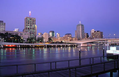
A fun effect
I saw somebody ask about this effect on a forum, and I thought it might be fun to play. I can't imagine anybody will ever use it, but hey, it's the weekend, why not mess around?
Before:
 After:
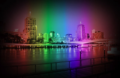
 After:

Thursday, August 26, 2010
Fading a background into a floor
I've written previously about replacing backgrounds, and here's another example, this time with a plain background blending into the floor. Thanks to Rebecca from California for her permission to use this photo.
This works best if your background and floor are very similar in colour and tone. If you try to work with vastly different tones, it will look nice, but not realistic.
1. Sample a suitable colour with your eyedropper tool. I chose a bit of wall near the child's torso (circled):
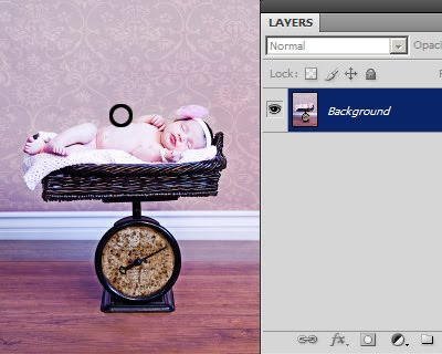
This works best if your background and floor are very similar in colour and tone. If you try to work with vastly different tones, it will look nice, but not realistic.
1. Sample a suitable colour with your eyedropper tool. I chose a bit of wall near the child's torso (circled):

Friday, August 20, 2010
Preparing headshots to exact size
This is something that comes up from time to time, often for Senior Yearbooks. They ask for images of a certain size, and in particular they want the head sizes to be very precise.
Here's an example from a while ago. The specs were:
Yearbook headshot images
2.5" by 3.5" 300ppi jpeg
Headsize: 1" from tip of chin to top of forehead
Here's a way to do it (in Photoshop, not sure about Elements):
1. Make a new blank document, 1 inch x 1inch @ 300ppi.
2. File>Place to place your photo into the new 1in document.
3. When placed, the image will have the "transform handles" to allow you to resize your photo until it fits the 1in height exactly as specified (chin to top of forehead). (See notes below for more resizing info.) Press Enter to commit the transform.
4. Image > Reveal All.
5. Choose your Rectangular Marquee Tool. Choose "Fixed Size" in the options bar, and enter 2.5in, 3.5in.
6. Place your marquee on the image, and move around where you want the crop to fall.
7. Image > Crop.
8. Ctrl D to deselect.
At the end of all this, it should give you a 2.5 x 3.5 inch image, in which the head is exactly 1 inch high. Obviously, you can modify the above instructions depending on the specifications you've been given.
By the way, don't forget to submit your jpegs in sRGB colour space, unless you've been given very specific instructions to the contrary. If they ask for CMYK, make sure you find out exactly what CMYK profile is required.
Notes about resizing using the transform handles:
1. Make sure you only use the corner handles, not the side ones.
2. Make sure you hold down the Shift key while dragging the corner handles, to ensure the proportions are maintained.
3. Make sure you release your mouse button BEFORE releasing the Shift key.
Yearbook headshot images
2.5" by 3.5" 300ppi jpeg
Headsize: 1" from tip of chin to top of forehead
Here's a way to do it (in Photoshop, not sure about Elements):
1. Make a new blank document, 1 inch x 1inch @ 300ppi.
2. File>Place to place your photo into the new 1in document.
3. When placed, the image will have the "transform handles" to allow you to resize your photo until it fits the 1in height exactly as specified (chin to top of forehead). (See notes below for more resizing info.) Press Enter to commit the transform.
4. Image > Reveal All.
5. Choose your Rectangular Marquee Tool. Choose "Fixed Size" in the options bar, and enter 2.5in, 3.5in.
6. Place your marquee on the image, and move around where you want the crop to fall.
7. Image > Crop.
8. Ctrl D to deselect.
At the end of all this, it should give you a 2.5 x 3.5 inch image, in which the head is exactly 1 inch high. Obviously, you can modify the above instructions depending on the specifications you've been given.
By the way, don't forget to submit your jpegs in sRGB colour space, unless you've been given very specific instructions to the contrary. If they ask for CMYK, make sure you find out exactly what CMYK profile is required.
Notes about resizing using the transform handles:
1. Make sure you only use the corner handles, not the side ones.
2. Make sure you hold down the Shift key while dragging the corner handles, to ensure the proportions are maintained.
3. Make sure you release your mouse button BEFORE releasing the Shift key.
Wednesday, August 11, 2010
What you see when you pixel-peep
Even though we usually view our images at arm's length, so to speak, sometimes it's necessary (and tempting) to view them up close - reeeeeeeally close - to see the pixel detail.
How do I "pixel peep"?
By viewing at 100% in your imaging program. 100% means that one image pixel is being represented by one screen pixel. If you view smaller than that, you're not getting a true representation of the pixels. If you view larger than that, you're getting an exaggerated representation, and that can make things seem worse than they really are.
Oh, gee, that's huge!
Yes, it is. 100% size on screen is much bigger than 100% size in print. If we make the broad assumption that the average print resolution is 300ppi, and the average LCD screen resolution is 100ppi, then your on-screen view will be three times longer/wider than the corresponding print view.
How do I "pixel peep"?
By viewing at 100% in your imaging program. 100% means that one image pixel is being represented by one screen pixel. If you view smaller than that, you're not getting a true representation of the pixels. If you view larger than that, you're getting an exaggerated representation, and that can make things seem worse than they really are.
Oh, gee, that's huge!
Yes, it is. 100% size on screen is much bigger than 100% size in print. If we make the broad assumption that the average print resolution is 300ppi, and the average LCD screen resolution is 100ppi, then your on-screen view will be three times longer/wider than the corresponding print view.
Tuesday, August 3, 2010
Selective sharpening?
I had an interesting snippet of conversation with one of my lovely trainees, Amy, today. We were discussing "eye pop" (using Levels, of course!), and Amy asked me if I ever found it necessary to selectively sharpen eyes.
The answer is no, hardly ever. I've probably only done it once or twice in the last year.
For one thing, sharpening is not the best way to make eyes pop. There are invariably better and more natural ways to do it. I don't think eyes should get any more or less sharpening than the rest of a photo.
But that's the thing. When sharpening is done properly, it automatically applies most strongly to the areas of best focus. And what is the usual focal point of a portrait? The eyes, of course. So when I sharpen a portrait, I find that as long as I use the Threshold slider correctly in USM, the eyes get the main "hit" of sharpening, without having to trouble myself with selecting or masking.
Saturday, July 31, 2010
Footnote: noise removal
One of the reader comments on my previous post about Raw noise removal reminded me of an issue I should have mentioned earlier.
The new generation of DSLRs, such as the Nikon D700 and the Canon 5DMkII, have fantastic ISO capabilities. If you are shooting with one of these, at low ISOs, it's easy to comfortably ignore noise removal, because the images are so "clean".
But I hark back to an important point in my previous post - namely, the awfully high default setting of the Color noise slider.
As I discussed, a too-high setting on that slider will go way beyond fixing colour noise, and begin "fixing" - that is, ruining - good colour in your pixels. That default setting of 25 is outrageously high for a D700 or a 5DII.
So I urge you not to be complacent. Always check the noise situation, and only use as much colour noise removal as is absolutely necessary. In some cases, you'll only require a setting of 2, 1, or even 0.
The new generation of DSLRs, such as the Nikon D700 and the Canon 5DMkII, have fantastic ISO capabilities. If you are shooting with one of these, at low ISOs, it's easy to comfortably ignore noise removal, because the images are so "clean".
But I hark back to an important point in my previous post - namely, the awfully high default setting of the Color noise slider.
As I discussed, a too-high setting on that slider will go way beyond fixing colour noise, and begin "fixing" - that is, ruining - good colour in your pixels. That default setting of 25 is outrageously high for a D700 or a 5DII.
So I urge you not to be complacent. Always check the noise situation, and only use as much colour noise removal as is absolutely necessary. In some cases, you'll only require a setting of 2, 1, or even 0.
Subscribe to:
Posts (Atom)