To mark the 6-month anniversary of my ACL reconstruction, I asked my wife to take a few shots of me on the trampoline, demonstrating my renewed confidence in the ol' knee.
The down-low-looking-up composition made for some impressive captures, but there was a backlighting problem, of course.
So it became fodder for this tutorial ... Processing and blending two exposures.
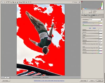
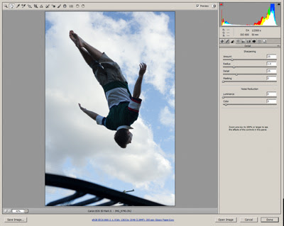
I began by processing the raw file twice - once where the sky was perfect, but I was too dark; and once where the sky was blown out, but I was just fine:
Sunday, May 30, 2010
Saturday, May 29, 2010
Making PDFs from Photoshop
If you're using Photoshop to design an advertisement, or a flyer, or whatever, make sure you don't flatten the layers before you save the PDF.
The reason is that it's important to preserve text as vectors. Vectors are mathematical shapes which are infinitely re-sizable; as opposed to pixels which cause all sorts of problems when resizing, as we know.
Let's take a look at an example.
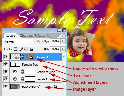
Here, I've prepared a simple file, with a mottled grey background, some adjustment layers, some text, and an additional image clipped with a vector mask:
Tuesday, May 25, 2010
Best practice for web photos
Question asked on a forum recently: "How do you optimize your picture for the web?"
Well, such a broad question is great fodder for a nerd like me, so I let rip with a longish reply ...
Well, there are a few vitally important things you need to do for your web images.
1. Make sure they are resized to the exact pixel dimensions required for the destination site/blog. If you upload them too big, the server (or browser) will resize them for you, and probably not do a very good job.
Web images are always sized in pixel dimensions. Some people will tell you that they have to be 72ppi - that's baloney. They can be a million ppi if you like. All that matters is the number of pixels. For example, all Facebook images should be 720 pixels on the longest edge (either wide or high). For another example, my blog requires images to be no greater than 590px wide. You'll need to interogate your own site/blog/whatever, and find out the exact required size.
Friday, May 21, 2010
Tiff files for printing
I received a question today - in a roundabout way - about using Tiff as a format for printing at a lab.
The correspondent shoots in Raw format, then edits and takes Tiff files to his lab for printing. Apparently, this particular lab needs Jpegs for their print process, so they convert his Tiffs to Jpegs before printing.
The correspondent's question was "Is Jpeg ok for printing, or should I be looking for a lab who can print Tiff files?"
I'll answer the second part of the question first. No, you needn't look for another lab just because your present lab can't print Tiff files. There are plenty of reasons you might need to switch labs (eg poor colour reproduction, inferior paper, slow turnaround, lousy customer service, etc) but file format certainly isn't one of them.
Sunday, May 16, 2010
Multiplicity
What do you do for kicks on a weekend? I beg my wife to set up her camera and tripod so I can have a bit of multiplicity fun!
"Multiplicity" is where you put yourself (or someone else) several times in the same photo. It's easy to do, and always makes people look twice! The best part is thinking up fun ideas - I have another one I'm itching to try out, but it will involve a trip to Ikea at some stage!
For this one, my wife took these three photos of me:
Wednesday, May 12, 2010
Grrrr ... banding!
Yesterday, on a forum, I saw a common lament. The member had a photo with a broad blue sky, and was complaining about the banding evident in it.
Banding is such a tricky beast, mainly because it's darn hard to tell whether it's genuinely in the image, or if it's just your screen. This makes you as nervous as hell, because you are wondering if it will occur in print.
As it happened, I couldn't see the banding on my screen in this particular photo that had been posted. This caused me to suspect that it was just the guy's screen that was showing a non-existent problem. I asked him for details of his monitor, and sure enough, it was a fairly cheap TN panel, which are prone to this kind of thing. (Ironically, it seems to occur more prominently in a calibrated screen than an uncalibrated one.)
Sunday, May 9, 2010
Critiquing sharpness
Asked on a forum today: "Can someone explain what determines a photo being too sharp, or not sharp enough?"
This is a great question!
Firstly, it's necessary to distinguish between "focus" and "sharpening". "Focus" is what happens in camera - eg when your lens really nails every single eyelash in a portrait. It's really not possible for an image to be "too well-focused". The better the focus, the better the result.
"Sharpening" is the artificial stuff we add after the event. If you shoot Jpeg, your camera might add some sharpening immediately after it captures the image. And you certainly get to add sharpening in post-processing when you get your images back to your computer. There are sharpening tools available in every imaging software, and the idea is to enhance the distinction of edges in the image, to make the focus seem even better than it was.
Saturday, May 8, 2010
Luminosity Selections
This is such a great tip, I can't believe I didn't think to write it before! Sorry Elements users, this one isn't for you.
A "Luminosity Selection" is the ability to make a selection based on the lightness/darkness of the tones in your image. The brighter the pixel, the more distinctly it's selected.
Up to Photoshop CS3, a luminosity selection was created by holding down Ctrl, Shift and Alt (Cmd-Shift-Option on Macs, I guess) and pressing the ~ key (that's the one at the top left of your keyboard). From CS4, it was changed to Ctrl-Shift-Alt-2 (not F2, just plain 2).
Friday, May 7, 2010
The lies they tell us in Kindergarten
I had this discussion with a trainee today, and it's worth sharing here.
We were adding saturation to a landscape photo, and the conversation turned to grass. Specifically, the fact that grass ain't green! Well, not always.
Almost as soon as we were old enough to hold a crayon, we were taught to draw green grass and blue skies (and houses where the windows are much higher than the doors, for some reason, but that's another matter!). But this isn't necessarily the case. Technically speaking, grass usually has a much stronger yellow component than green, and skies are invariably stronger in cyan than blue, unless a filter has been used in the capture.
To the average person, this doesn't matter a damn. And even to a photographer, it's not always a problem ... until you need to edit those elements. If you've ever used Hue/Saturation or Selective Color to adjust grass or a sky, you'll know what I'm talking about. If you choose "Greens" or "Blues" respectively, your adjustments tend to be weak at best. But if you look at the colours the way Photoshop looks at them, you'll realise that "Yellows" and "Cyans" are where the answer lies.
I guess there are dozens of examples of this. Green apples are another one that springs to mind - not green at all! So if you're having trouble editing a particular colour, stop for a moment and try to think like Photoshop - is it really the colour you think it is?
Tuesday, May 4, 2010
Printing big? Test small first
Getting a really big print done for the first time is as scary as hell, isn't it? It's really expensive, and you're afraid that you'll blow your dough because the shot isn't good enough, or your camera doesn't have enough megapixels.
First, I want to point you to my article here: How big can I print my photo? You'll find it puts your mind at ease.
Secondly, I want to talk about the practical solution - getting a small test print done first. Taking a small centre crop of the full-size image is a very cheap way to see how your large print will turn out.
Saturday, May 1, 2010
Jpegs in ACR
Photoshop version CS3 was significant for a number of reasons, one of which was the introduction of Jpeg editing in ACR.
I want to start with some clarification. Using ACR to edit Jpegs is really handy, if you're comfortable with the interface, the sliders, etc. An ACR workflow is slick and convenient once you know what you're doing.
BUT ... too many people mistakenly think they have all the benefits of Raw by editing their Jpegs this way. Not so. A Jpeg file is still just a Jpeg file - it doesn't have the enormous dynamic range of a raw file, nor the wonderful bit depth. As I've said before: "If I take my hatchback car to a luxury car dealership for a grease and oil change, it doesn't make it a luxury car - it's still a humble hatchback, with new grease and oil." If you truly want exquisite control over your images, you should shoot in Raw format.
Anyway, let's talk about editing Jpegs in ACR. It all begins in Bridge. If you're not using Bridge, I recommend it - it's a great program for browsing and previewing your images, not to mention all the other great functions.
Subscribe to:
Posts (Atom)
Comments or Questions?
If you have anything to add or ask about this article, please visit me at my Ask Damien page.