Friday, February 26, 2010
16-bit to 8-bit
I mentioned this in passing on a forum today, and wanted to elaborate a little.
If you choose to edit your images in 16-bit mode, then of course you need to convert to 8-bit for printing at the end.
Your final steps for printing probably include:
> Flatten layers
> Crop/resize
> Convert to 8-bit
> Sharpen
> Save
Now, the order of some of those steps is flexible. You could resize before flattening, for example. Some people say it's important to sharpen while still in 16-bit, and they're probably right (I haven't checked).
Monday, February 22, 2010
What makes a great black-and-white photo?
Black-and-white imaging is tricky - if it's done well, it looks amazing; but if it's done poorly it looks awful.
So what's the key to a good one? Well, it's right there in the name - black and white.
The name of the craft is not "Shades-of-dark-grey-and-light-grey photography". It's "Black-and-white photography".
For a B-W photo to smack the viewer in the face, it needs to have plenty of blacks and whites. Any area of significant detail without a black and a white in it somewhere is flat, dull, and uninspiring. The photo needs plenty of contrast, not only globally, but in all the detail.
Wednesday, February 17, 2010
Multiple light sources ... AAAAAAAAGGHH!!!!
What's your worst enemy in post-processing? Noise? Nope. Underexposure? Nah.
It's multiple light sources! I hate them so much!!!!!
Well, let me clarify. You can take a photo with as many light sources as you like, as long as they're exactly the same temperature. But if you have a photo with two or more sources of different coloured light, it's a nightmare to edit.
Usually the problem arises in photos which are taken indoors, with an overhead light and a window providing the illumination. The bulb light is quite yellow, and the natural light is bluer by comparison. If both the warm light and the cool light are striking the subject's face, it's bloody awful to try to balance.
I'd rather edit an underexposed, noisy, yellow photo over a perfectly-exposed, clean photo with two light temperatures. One white balance problem is easy to fix; more than one in the same photo is very difficult.
So, make things easy for yourself. You can shoot in natural light, or fluorescent light, or tungsten light, or whatever ... just make sure there's only one light temperature. You'll save yourself plenty of headaches back at the computer.
Monday, February 15, 2010
Itty bitty tips for PS on PC
PC Photoshoppers, did you know ...
1. Simply double-clicking on the grey background of the Photoshop workspace will bring up the File > Open dialog? Quicker than reaching for the menu, or even Ctrl O.
2. Ctrl-Tab will toggle through your open images? Actually, this is true for other applications as well ... while Alt-Tab toggles between applications, Ctrl-Tab toggles between documents within an application.
These two shortcuts might not seem like much, but if they can save you a few seconds every few minutes, it all adds up to a quicker workflow.
When I was a young bloke, the first time I worked at a newspaper, a wise old tradesman gave me an excellent tip. He said (paraphrasing): "Shortcuts will improve your work, but don't try to learn them all at once. Pick one or two each week, and build them into your workflow. For the first few days they'll feel slow and unintuitive, but by the end of the week they'll be as natural as breathing."
He was dead right. Little by little I've trained myself in heaps of keyboard shortcuts in all of the Adobe programs, and I do them instinctively, without even really knowing what my fingers are doing.
Saturday, February 13, 2010
Video tute: B/W conversion action
Here is my first attempt at a video tutorial ... I hope the quality is ok!
I've shared my black-and-white conversion action on my site here. It's very simple, and fairly self-explanatory.
I've recorded a brief video to demonstrate it. I hope you find this useful.
Sunday, February 7, 2010
Multiple images in one PSD
This post is following up a discussion I had, which was following up my Trash those Jpegs article. Unfortunately, this won't work too well in Elements, which doesn't have Layer Groups, as far as I'm aware. Please correct me if I'm wrong.
Sometimes you might have processed an image a few different ways - eg once in "clean" colour, once as black-and-white, and once as a Vintage colour.
Normally, you'd expect to have one file for each of those styles. This places additional burden on your hard drive space, of course.
But with a proper layer-based workflow, it should be entirely possible to use the one PSD to house all of those styles. I do it simply by grouping my adjustment layers together and naming them appropriately.
Let's take a look at an example ...
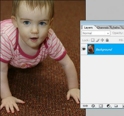
Here's an unprocessed image:
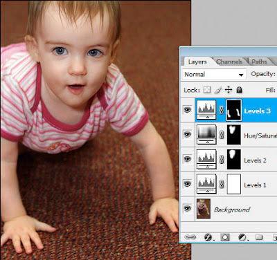
 First thing I do is my normal "clean" processing, using a few simple adjustments:
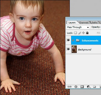
 I'll group those adjustment layers together, and call the group "Enhancements".
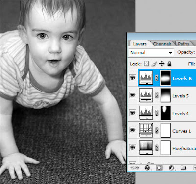
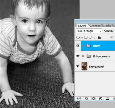
 Hmmm ... what next? I think this might look good in black-and-white. I'll convert and make a few additional adjustments as required:
 And again, I'll group those layers into their own group:
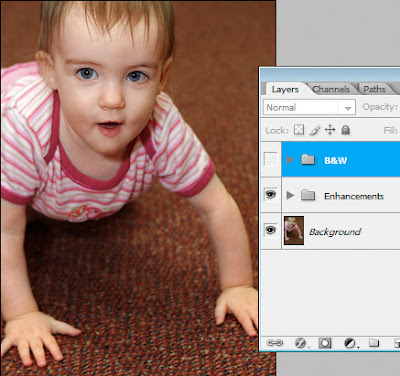
 Now I'll simply hide that B&W layer. Now I'm back to my colour image. You can see how this is much easier than closing down the black-and-white one, and re-opening the colour one. It's all in one file!
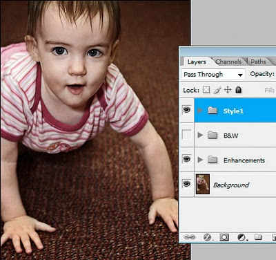
 So, I'll keep going. I'll try a kinda "grungy" style ...
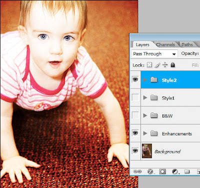
 ... then turn that off and try a "burned colour" sort of style:
 So I hope you can see the advantages to this. As you know, adjustment layers add almost nothing to file size - they are tiny. The only layers that add significant file size are pixel layers - ie my Background layer. If I had saved four different PSD versions of this image - one clean colour, one black-and-white, one grungy and one burned colour - then I would have been saving that big Background layer onto my hard drive four times. This way, I'm only saving it once.
More food for thought :)
So I hope you can see the advantages to this. As you know, adjustment layers add almost nothing to file size - they are tiny. The only layers that add significant file size are pixel layers - ie my Background layer. If I had saved four different PSD versions of this image - one clean colour, one black-and-white, one grungy and one burned colour - then I would have been saving that big Background layer onto my hard drive four times. This way, I'm only saving it once.
More food for thought :)
 First thing I do is my normal "clean" processing, using a few simple adjustments:
 I'll group those adjustment layers together, and call the group "Enhancements".
 Hmmm ... what next? I think this might look good in black-and-white. I'll convert and make a few additional adjustments as required:
 And again, I'll group those layers into their own group:
 Now I'll simply hide that B&W layer. Now I'm back to my colour image. You can see how this is much easier than closing down the black-and-white one, and re-opening the colour one. It's all in one file!
 So, I'll keep going. I'll try a kinda "grungy" style ...
 ... then turn that off and try a "burned colour" sort of style:
 So I hope you can see the advantages to this. As you know, adjustment layers add almost nothing to file size - they are tiny. The only layers that add significant file size are pixel layers - ie my Background layer. If I had saved four different PSD versions of this image - one clean colour, one black-and-white, one grungy and one burned colour - then I would have been saving that big Background layer onto my hard drive four times. This way, I'm only saving it once.
More food for thought :)
So I hope you can see the advantages to this. As you know, adjustment layers add almost nothing to file size - they are tiny. The only layers that add significant file size are pixel layers - ie my Background layer. If I had saved four different PSD versions of this image - one clean colour, one black-and-white, one grungy and one burned colour - then I would have been saving that big Background layer onto my hard drive four times. This way, I'm only saving it once.
More food for thought :)
Friday, February 5, 2010
Editing skintones in Photoshop Elements
A lady wrote to me today to ask my advice about editing skintones in Photoshop Elements.
Her problem is shared by all Elements users - namely, the absence of CMYK numbers in the Info Palette. There are lots of tutorials on the web about editing skintones, but most of them advise doing it by the CMYK values. You know the kind of thing - "Cyan 1/3 of Magenta, Yellow slightly higher, etc".
How do you edit "by the numbers" if you don't have the numbers?
Well, the first answer is "by looking at the photo!" This might seem flippant, but seriously, it's possible to get so bogged down in "technical this" and "percentage that" that you forget to just look.
If your instinct says "that guy is too rosy" or "healthy people don't look as grey as that" or "she's too dark" or whatever, then that's what counts. Are people going to hang a little Info Palette beside your photo on their living room wall? Of course not. (Actually, that would be pretty funny!)
But, despite all that, I'm aware of the value of numbers. It's easy to start second-guessing yourself on skintones, and it's certainly easy to over-process and get lost in a mess of adjustments, and start to go insane. It's great to have numbers that you can check.
So, are Elements users doomed to insanity? No, of course not. You've got numbers - RGB ones.
RGB numbers aren't too hard to get used to. Broadly speaking, the rule is pretty simple: R>G>B. The Red value will always be higher than the Green value, which in turn will be higher than the Blue value.
Let's get a bit more specific. The Red value will usually roam between the mid-100s (in shadow areas) to mid-200s (in highlight areas).
The Green and Blue channels will usually roam from just under 100 to just over 200. What's important is the margin. The Green value will be an average of 20-30 points higher than the Blue value. If you keep that approximate margin, the colour of the skin will look good.
Please note that I'm talking about sRGB numbers here. If you consider yourself advanced enough to use Adobe RGB or ProPhoto RGB, then I would expect you to already be very proficient with skintones, and you don't need my help.
So don't despair that you can't afford a full version of Photoshop; and please don't think that you can't achieve great photos and great skintones in Elements. It's a powerful tool, and with a little practice, you'll be able to adapt CMYK-centric tutorials for your purposes.
Lastly, I want to say that people who truly understand how the R, G and B channels interact to make colour will become masters of their craft. CMYK numbers are not "real" values, and in the long run, will teach you very little about digital colour.
Please take a moment to read my Ramblings about skin, where you'll find some more useful information.
Thursday, February 4, 2010
Trash those Jpegs!
Some of you would have seen this when I posted on a forum today. But it's great blog fodder, so I can't pass up the opportunity to post it here as well!
There have been a few questions about workflow and file formats lately, so I'd like to share some thoughts here.
I'm going to make a suggestion about workflow. But please understand that there are as many workflows as photographers, and the one that's right for you is the one that works for you. Feel free to embrace, adapt or ignore as you please.
This is a Photoshop-based workflow. I don't use Lightroom, and I refuse to do so until they fix the colour space issues. Anyway ...
Part 1. The camera file
Whether you shoot Raw or Jpeg is immaterial. If you shoot Jpeg, you can open your image directly into Photoshop. If you shoot Raw, it goes through ACR first. Either way, it ends up in Photoshop.
Your camera file (Raw or Jpeg) is the precious original. You work from it, but you don't delete or change it.
Part 2. The PSD
Once the image is in Photoshop, the first thing you do is "Save As" and save it as a PSD file. A Tiff file is fine too (I use PSD because it's the easy default, and I'm lazy, and I see no reason to do otherwise).
PSD and Tiff are the Great Almighty File Formats. They can be high bit, have layers, have extra channels, etc. They're big (because there's no compression) but they're beautiful.
Part 3. The editing
Ok, so you go ahead and do your thing. Edit however you please (layers, actions, whatever) and save frequently. As you know, I do not recommend cropping, resizing or sharpening this master file in any way.
Part 4. The archiving
Once you've created your masterpiece, you back it up, archive it, and keep it forever. You might choose hard drives, or DVDs, or online storage ... it doesn't matter. The point is, you keep your magnificent work of photographic art safe for the rest of your days.
As well as that PSD, you can also archive your original camera file. Well, you don't have to, I guess, but it's probably not a bad idea.
Ok, so that's the whole workflow, from camera file to archive. A lovely straight road to follow.
But what about output, Damien? I don't edit my photos just to archive them. I want to print them, or show them on the web.
This is where we come to "Disposable Jpegs".
After you've created your PSD masterpiece, it needs to be saved as a Jpeg for any form of output. All photos for the web need to be Jpegs, and while there's a few labs who will print PSDs, most will expect Jpegs.
So, you flatten the layers in your PSD, crop/resize and sharpen appropriately for the intended output, then save as a Jpeg. Then you upload your Jpeg - to your server if it's a web image, or to the lab if it's a print. (Or maybe it's going on a CD for a client). Once you've uploaded it ...
... DELETE IT.
There is very little point to keeping these Jpeg output files. They're just annoying little files that clutter up your hard drive. If you need another Jpeg tomorrow, just make it again from the PSD.
I know for a fact that a lot of people are keeping Jpeg copies of their files all over the place. I encourage you to take a look at your workflow and ask yourself "do I really need to keep this Jpeg file?" You might well find that the answer is "Um ... actually, no."
Food for thought.
Wednesday, February 3, 2010
Please ignore your monitor profile
You buy a monitor calibration device. You calibrate your monitor. Then what?
Nothing.
Not a thing. The monitor profile just sits deep in your operating system, where Photoshop and your other colour-managed programs know where to find it and refer to it. As the owner of the computer, your only task is to recalibrate regularly to make sure the profile is up-to-date.
Too many people get into trouble by setting their monitor profile as their Working Space, or assigning it to their images, or soft-proofing with it. None of those things are necessary, and all of those thing will end in tears.
Just leave it alone!
That is all.
Subscribe to:
Posts (Atom)