It's not unusual to witness confusion between these two options:
They're right next to each other in Photoshop's "Edit" menu, and they both involve changing your image from one colour space to another (eg Adobe RGB to sRGB); but they're vastly different functions, and definitely not interchangeable.
Let's be clear up front - if you need an image to go from one colour profile to another, it's 99.99999999999% likely that Convert to profile is the one you need. Assigning a profile is so darn rare that I can't think of a single reason why a photographer would need to do it in their day-to-day workflow.
Even if you read no further, this is the important message - Converting is your friend; assigning is almost always your foe.
Wednesday, December 1, 2010
Monday, November 29, 2010
Canvas is great!
I often see photographers on forums saying "I'm thinking about getting a canvas printed - is this photo good enough?"
There's a very simple rule here: If you like it on screen, you'll LOVE it on canvas.
Canvas is wonderful. Nothing beats a great photo enlarged on your wall.
There's a very simple rule here: If you like it on screen, you'll LOVE it on canvas.
Canvas is wonderful. Nothing beats a great photo enlarged on your wall.
Wednesday, November 24, 2010
New action: Rule of Thirds cropping guide
I just posted a new addition to my actions page:
Rule of thirds cropping guide
Hope it helps somebody!
Rule of thirds cropping guide
Hope it helps somebody!
Wednesday, November 17, 2010
Colour modes vs colour spaces
Sometimes, in my virtual travels, I see this question: "I thought I was working in sRGB, but it still says RGB at the top of the window in Photoshop!"
This refers to the title bar, where it says "RGB/8":
At the heart of this question is a common and lamentable problem - people refer to Adobe RGB as simply "RGB". This is bad. Adobe RGB is a type of RGB. RGB is a colour mode, whereas Adobe RGB is a colour space. Let me explain with an analogy ...
When I'm out driving, I see several modes of transport - eg cars, buses, motorcycles and trucks. Each of those transport modes have their own purposes, their own benefits, and their own drawbacks. Within those modes are various types - if you drive a car you could choose a Toyota, a BMW, a Hyundai, a Porsche, etc, etc. If a motorcycle is your preferred mode, you could choose a Ducati, a Honda, etc. And so on.
Tuesday, November 9, 2010
So, you've discovered you're in Adobe RGB ...
This article has been removed, because it has been superseded by this even better one.
Thursday, November 4, 2010
Choosing house paint colours
Our poor old house hasn't been painted for a long time, I'd say. It's fading and peeling and sad; and frankly, the colours are daggy:
Time to reach into the savings and get it done. We've more or less settled on a painter, but choosing colours is HARD! Luckily, I know a guy who knows Photoshop ;)
I guess there are numerous ways to do this, but I found I like using Hue/Saturation with Colorize.
Time to reach into the savings and get it done. We've more or less settled on a painter, but choosing colours is HARD! Luckily, I know a guy who knows Photoshop ;)
I guess there are numerous ways to do this, but I found I like using Hue/Saturation with Colorize.
Saturday, October 30, 2010
How I've been sharpening for web lately
I've seen much discussion recently about sharpening methods for web, so I thought I'd throw in my two cents. As always, my intention is to help you understand the process, not just follow steps by rote, or rely on actions.
I must say my web sharpening method (and taste) have evolved a bit over the last few years, but I'm happy with where I'm at now.
I usually use Unsharp Mask, and that's what I'll be discussing here. To get the best value out of this post, I strongly recommend you read my thorough explanation of USM here, and my overview of web image practices here, if you haven't already.
So, I edit my image, I save the master file, blah blah blah. Then, when I'm ready to prepare a web-size proof, I flatten the layers, then resize to the appropriate pixel dimensions. Remember, your sharpening will be for naught if you don't get the size exactly right beforehand. To resize I use either the Crop Tool, the Image Size dialog, or Fit Image, depending on the circumstances. I use plain ol' Bicubic method for interpolation, but that's because I'm lazy! You should experiment with the Bicubic Sharper method to see if you like it better.
Monday, October 25, 2010
Shift while brushing
I have been surprised to discover that not everybody knows about the Shift key.
Lol! Obviously everyone knows about the Shift key. What I mean is, not everyone uses it in conjunction with their Brush Tool, particularly while masking.
The principle is perfectly simple - try it yourself and see. Take your brush tool, and click once to paint a dot somewhere on your image. Then hold down the Shift key and click somewhere else. The Brush Tool will automatically draw a straight line between one point and the other.
Now, I guess you mightn't have to paint straight lines all that often, but gradual curved lines are a fairly frequent matter, at least for me. For example, if I'm masking around someone's body, the Shift key is my best friend. Rather than trying to paint the mask freehand, I can do it much faster and easier with a series of Shift-clicks around the subject.
There were only three or four clicks in the above line, whilst holding down the Shift key. In this way, I can mask around an entire person in lightning-fast time. Once I've done the outline, I can easily fill in the rest of the mask with the Paint Bucket tool.
Sunday, October 24, 2010
Tips for photographing old photos for restoration
The following post is by my beautiful wife, Lara:
Every now and again, Damien is given old, fragile photographs to be painstakingly restored.
Generally he scans them (sometimes in a few different pieces) but sometimes they're too big for the scanner, or are too fragile to be scanned. In those instances he needs me to photograph them for him instead, and he asked me to share some tips on how to do this.
Tuesday, October 12, 2010
The role of masks when cloning
Some things are easy to clone; some things are really hard. It all depends on the photo. Cloning a speck of dust from a blue sky is a piece of cake, but the same speck on somebody's face can be a nightmare.
In this post I want to discuss cloning something out from behind something else. When an undesirable object directly intersects behind your subject, it takes some careful work to ensure a realistic result. BUT ... most people assume that the careful work has to be performed with the Clone Tool itself. Not so.
The secret - if laziness can be called a "secret" - is to be really loose and rough with your cloning. The careful part comes with the subsequent masking.
Thursday, October 7, 2010
Urban Processing: Some Ideas
I think urban processing is cool. The right photo, with the right "gritty" editing, looks modern and eye-catching. I guess it's not to everyone's taste, but I love it.
There are various tutorials and actions available to give your photos an "urban" look, but not every photo responds desirably to these standard methods, and anyway, do you really want your photos to look the same as everyone else's? You'd like your portfolio to be unique and memorable.
I'd like to share two simple methods for you to try. Two methods, but infinite variations - no two photos will ever look the same.
(The trouble with not being a photographer myself is that I don't always have a ready supply of images with which to illustrate tutorials. Therefore, I am indebted to Beth Ritchie, Danielle Mavrick and Kristen Parker for their permission to use the lovely photos herein.)
Friday, October 1, 2010
Question: Do Photoshop's Color Settings matter?
Answer: Not much.
This is a question that comes up quite a lot. It usually goes something like this: "My PS Color Settings say sRGB, but my images are coming out in Adobe RGB. WTF?"
(Actually, not many people say "WTF?" I just added that for emphasis.)
If you shoot Jpeg, the colour space of your photos is set in your camera. If you shoot Raw, the space is dictated by your raw processor. In either case, Photoshop will usually honour that profile, regardless of its own "default" setting.
So, what is Photoshop's "RGB Working Space" useful for then? Well, only two things, really. One is when you make a new blank RGB image, it will assume that space by default, unless you specify otherwise in the "New" dialog. The other is when you open an image without a profile of its own, Photoshop will give it the default profile for as long as it remains open (but it won't save it with that profile, unless you tell it to).
Neither of the above circumstances arise a whole lot. For most of us, most of the time, we need to concentrate on setting the colour space where it matters - in Raw.
In ACR, you can choose your space in the Workflow Options (at the bottom of the screen). In Lightroom it's an export option, I believe.
The part of the PS Color Settings dialog that really matters is the "Color Management Policies" section. Unless you have a very good reason to do otherwise, make sure those are all set to "Preserve Embedded Profiles".
You can find more information about Photoshop's Color Settings in my article here.
Thursday, September 23, 2010
Bit depth ... explained by cake
In conversation today I was asked to explain 8-bit vs 16-bit.
Let me say at the outset that I'm on a no-sugar diet, so I'm craving cake! I can't stop thinking about cake. Mmmm ... cake ... Folk who know me know I can explain most things with cake analogies, and bit depth is no different. Here goes ...
The purpose of editing in 16-bit is to completely negate the risk of visible degradation during pixel editing. You'll be most familiar with this degradation as "banding" - where large areas of similar detail "break up" and leave visible blockiness after editing. Blue skies are notorious for it, and so are white backdrops. I discussed banding and bit depth a little in this post, and this one.
Saturday, September 18, 2010
All about monitor calibration
The answers to every question you've ever asked, wanted to ask, or didn't even know you were supposed to ask ...
What is a monitor calibrator?
It's a small hardware device that you place on your screen to perform the calibration process.
They vary in size and shape between brands, but loosely speaking they're about the size of a mouse. They are USB-powered, and come with software to control the process. They function equally well on both Mac and PC (I'm not aware of any calibrators that only work on one platform).
What is monitor calibration?
What we commonly refer to as "calibration" is actually two consecutive processes - "calibration" and "profiling". This distinction is important.
Sunday, September 12, 2010
Resolution and resolution
Some of my readers would have seen my post entitled "Let's talk about Resolution" on the CM forum a few months ago. I've just updated and expanded it, and added it to the articles on my website:
Resolution and resolution
I hope it helps clear up some of the confusion that surrounds this topic.
Monday, September 6, 2010
"Extract then copy" vs "Copy then extract"
If you need to take someone or something out of one photo, and place them in another photo, it takes some finesse to make it look right. The size has to be right, the angles have to be plausible, and the colour and direction of the light can make or break the job. All of those things are fodder for another post on another day.
Right now, I want to talk about the cut-and-paste job itself.
Adobe give us plenty of ways to select part of a photo - magic wand, pen tool, lasso tool, marquee tool, quick mask, quick selection tool, color range, etc, etc. With each new version of Photoshop, the options become more numerous and powerful. Over time, you'll master some or all of these methods.
Here's the thing - if you want to put part of one photo into another photo, it's easy to assume that you need to cut that part out, then copy it across.
NO.
If you do it that way, you need to be 110% certain that your selection is perfect before you cut and paste. And frankly, it's impossible to be certain about that.
No, the best method is to copy the whole image across (or a generous relevant portion of it, anyway). Then use your favoured selection/extraction method to create a mask on that layer, to simply hide the unwanted background. This way, you've got infinite control over your selection, and if you discover that you messed up and gave somebody a three-fingered hand, or something, you can easily modify the mask to fix the problem.
Saturday, September 4, 2010
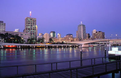
A fun effect
I saw somebody ask about this effect on a forum, and I thought it might be fun to play. I can't imagine anybody will ever use it, but hey, it's the weekend, why not mess around?
Before:
 After:
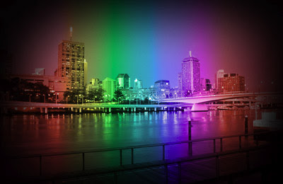
 After:

Thursday, August 26, 2010
Fading a background into a floor
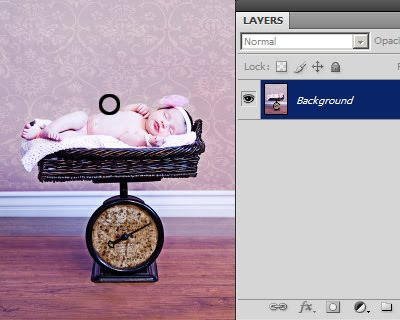
I've written previously about replacing backgrounds, and here's another example, this time with a plain background blending into the floor. Thanks to Rebecca from California for her permission to use this photo.
This works best if your background and floor are very similar in colour and tone. If you try to work with vastly different tones, it will look nice, but not realistic.
1. Sample a suitable colour with your eyedropper tool. I chose a bit of wall near the child's torso (circled):
This works best if your background and floor are very similar in colour and tone. If you try to work with vastly different tones, it will look nice, but not realistic.
1. Sample a suitable colour with your eyedropper tool. I chose a bit of wall near the child's torso (circled):

Friday, August 20, 2010
Preparing headshots to exact size
This is something that comes up from time to time, often for Senior Yearbooks. They ask for images of a certain size, and in particular they want the head sizes to be very precise.
Here's an example from a while ago. The specs were:
Yearbook headshot images
2.5" by 3.5" 300ppi jpeg
Headsize: 1" from tip of chin to top of forehead
Here's a way to do it (in Photoshop, not sure about Elements):
1. Make a new blank document, 1 inch x 1inch @ 300ppi.
2. File>Place to place your photo into the new 1in document.
3. When placed, the image will have the "transform handles" to allow you to resize your photo until it fits the 1in height exactly as specified (chin to top of forehead). (See notes below for more resizing info.) Press Enter to commit the transform.
4. Image > Reveal All.
5. Choose your Rectangular Marquee Tool. Choose "Fixed Size" in the options bar, and enter 2.5in, 3.5in.
6. Place your marquee on the image, and move around where you want the crop to fall.
7. Image > Crop.
8. Ctrl D to deselect.
At the end of all this, it should give you a 2.5 x 3.5 inch image, in which the head is exactly 1 inch high. Obviously, you can modify the above instructions depending on the specifications you've been given.
By the way, don't forget to submit your jpegs in sRGB colour space, unless you've been given very specific instructions to the contrary. If they ask for CMYK, make sure you find out exactly what CMYK profile is required.
Notes about resizing using the transform handles:
1. Make sure you only use the corner handles, not the side ones.
2. Make sure you hold down the Shift key while dragging the corner handles, to ensure the proportions are maintained.
3. Make sure you release your mouse button BEFORE releasing the Shift key.
Wednesday, August 11, 2010
What you see when you pixel-peep
Even though we usually view our images at arm's length, so to speak, sometimes it's necessary (and tempting) to view them up close - reeeeeeeally close - to see the pixel detail.
How do I "pixel peep"?
By viewing at 100% in your imaging program. 100% means that one image pixel is being represented by one screen pixel. If you view smaller than that, you're not getting a true representation of the pixels. If you view larger than that, you're getting an exaggerated representation, and that can make things seem worse than they really are.
Oh, gee, that's huge!
Yes, it is. 100% size on screen is much bigger than 100% size in print. If we make the broad assumption that the average print resolution is 300ppi, and the average LCD screen resolution is 100ppi, then your on-screen view will be three times longer/wider than the corresponding print view.
Tuesday, August 3, 2010
Selective sharpening?
I had an interesting snippet of conversation with one of my lovely trainees, Amy, today. We were discussing "eye pop" (using Levels, of course!), and Amy asked me if I ever found it necessary to selectively sharpen eyes.
The answer is no, hardly ever. I've probably only done it once or twice in the last year.
For one thing, sharpening is not the best way to make eyes pop. There are invariably better and more natural ways to do it. I don't think eyes should get any more or less sharpening than the rest of a photo.
But that's the thing. When sharpening is done properly, it automatically applies most strongly to the areas of best focus. And what is the usual focal point of a portrait? The eyes, of course. So when I sharpen a portrait, I find that as long as I use the Threshold slider correctly in USM, the eyes get the main "hit" of sharpening, without having to trouble myself with selecting or masking.
Saturday, July 31, 2010
Footnote: noise removal
One of the reader comments on my previous post about Raw noise removal reminded me of an issue I should have mentioned earlier.
The new generation of DSLRs, such as the Nikon D700 and the Canon 5DMkII, have fantastic ISO capabilities. If you are shooting with one of these, at low ISOs, it's easy to comfortably ignore noise removal, because the images are so "clean".
But I hark back to an important point in my previous post - namely, the awfully high default setting of the Color noise slider.
As I discussed, a too-high setting on that slider will go way beyond fixing colour noise, and begin "fixing" - that is, ruining - good colour in your pixels. That default setting of 25 is outrageously high for a D700 or a 5DII.
So I urge you not to be complacent. Always check the noise situation, and only use as much colour noise removal as is absolutely necessary. In some cases, you'll only require a setting of 2, 1, or even 0.
Thursday, July 29, 2010
Raw noise removal
One of the golden rules of editing is to do as much in Raw as possible before moving into Photoshop, and noise removal is no exception. Noise must be removed in raw, because if you wait until later, the damage to your file has already been done.
So I'd like to share my approach to the noise removal sliders. This article is written using ACR in Photoshop CS4, but applies to all Adobe software, and should be relevant to other raw software too.
If you've ever dabbled with noise removal (of any sort) you'll know there are two controls for it - Luminance and Color. In ACR, the default values for the sliders are 0 and 25 respectively:
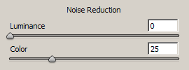
(Note: Newer versions of raw software have additional sliders, but they are largely unnecessary for day-to-day editing. This article will concentrate on these two important main sliders.)
It's important to understand the difference. Luminance noise is what we think of when we usually think of noise - graininess. Here's a close-up example of luminance noise:
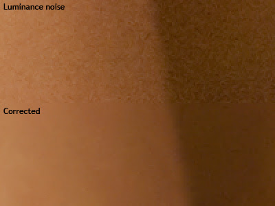
So I'd like to share my approach to the noise removal sliders. This article is written using ACR in Photoshop CS4, but applies to all Adobe software, and should be relevant to other raw software too.
If you've ever dabbled with noise removal (of any sort) you'll know there are two controls for it - Luminance and Color. In ACR, the default values for the sliders are 0 and 25 respectively:

(Note: Newer versions of raw software have additional sliders, but they are largely unnecessary for day-to-day editing. This article will concentrate on these two important main sliders.)
It's important to understand the difference. Luminance noise is what we think of when we usually think of noise - graininess. Here's a close-up example of luminance noise:

Sunday, July 11, 2010
Those family snaps
We had a first birthday in our house yesterday (happy birthday Rowan!), and it prompted me to write about the "happy snaps" that we take.
Most of us prefer to work with Raw files for any commercial photographic purposes - you can't go past the quality and flexibility of that wonderful raw data.
But the inescapable fact is that Raw files are big - darn big. So for that reason, it gets a bit cumbersome to store and backup thousands of candid photos of our own kids if they're all in Raw format. Therefore, I've seen many people say that they switch to Jpeg if they're taking everyday snaps around the house.
Wednesday, July 7, 2010
Batch processing in ACR
I've been promising this post for ages - I'm sorry it's taken so long :(
It's dead easy to process multiple files in Adobe Camera Raw. In fact, if you've got a set of images taken consecutively, you'd be nuts not to take advantage of this powerful functionality.
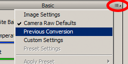
Before I discuss batch processing per se, I just want to mention the simple matter of copying a previous conversion. Let's say you open one image, and make some adjustments. When you open the next image, you can open the little ACR menu (circled in red in the following CS4 screenshot) and choose "Previous Conversion":

Saturday, July 3, 2010
Clarification re: print labs
After having yet another conversation about this, I'm writing this exasperated post ...
Just because your print lab accepts Adobe RGB files, doesn't mean they can print the entire Adobe RGB gamut.
A lot of consumer labs expect sRGB files, and print poorly if you give them something else. But the good labs can accept files in any colour space at all - Adobe RGB, ProPhoto RGB, etc.
Does this mean they can print any colour in the world? Of course not. It just means that they have an excellent colour-management workflow in place, and will convert your images to their print space before printing.
If you provide them with colours that are too bright for print, they'll be clipped, and won't print properly. Logical, right? But a lot of people seem to think that if their lab accepts Adobe RGB files, then they must be able to print the whole gamut. Not so, I'm afraid.
But here's the good news. If your lab is good enough to be able to accept any colour spaces, it stands to reason that they're also good enough to provide soft-proofing profiles. Check your lab's website for their print profiles, then soft-proof your images to see if any colours are at risk of clipping.
For more information, see my Soft-proofing tutorial
Monday, June 28, 2010
A rant about camera manufacturers
There's a school of thought, to which I mildly subscribe, that six megapixels is easily enough for most needs. (Google "6 megapixels" and have a look at some of the articles.) The truth is, a well-taken photo out of a six megapixel camera can be printed to just about any size, for just about any purpose. In the early days of digital, pros had 3MP cameras, and printed billboards from them.
If you really nail your composition, lighting, focus, etc, you can produce a masterpiece from a 6MP camera. On the flip side, if you mess up a shot, all the pixels in the world won't save you - it's still a messed-up shot. It's simply a messed up shot that's wasting more space on your card.
Of course, you can't find 6MP DSLRs any more. There's nothing below 10MP, and plenty pushing 20MP and beyond. And I think this is an appalling state of affairs.
Can you imagine, for a moment, what would have happened if camera manufacturers hadn't devoted so much R&D to putting more pixels on their cameras' sensors; but instead concentrated on making the quality output of the pixels better?
It's only been in the last year or so (with the release of the 5DII and the D700) that great strides have been made in image quality at high ISOs. In my opinion, the years between the beginning of this decade (when 6MP DSLRs were first released) and the end of the decade (when ISO advancements have been made) have been miserably wasted. If the manufacturers had forgotten about the number of pixels, and focused on their quality, we might now have cameras that would be utterly noise free, even at incredibly high ISOs. That would be wonderful.
But it's all marketing, isn't it? Bigger numbers sell more units. I'm sure there are plenty of us who yearn for Canon to release a camera with the capacity of the 10D, but the IQ of the 5DII (how good would that be???) but it ain't gonna happen. Because most cashed-up enthusiasts think that more pixels must be better; and Canon wants to take those people's money.
Wednesday, June 16, 2010
FAQ: "Help! My Raw files won't open!"
Sometimes, when timid Jpeg shooters take the leap and shoot in Raw format, they find that they can't open their Raw files, or even view them.
And other times, experienced Raw shooters upgrade their camera, then are startled to find they can't edit their first batch of Raw files.
"Help!!"
In almost all cases, this is because your camera is newer than your version of Photoshop. At the time of releasing a version of Photoshop, Adobe includes support for Raw files from all cameras which have been manufactured to that date. Then, as time goes by, they release updates to support newer cameras. Once they release a new version of Photoshop, they stop updating the previous version.
Sunday, June 13, 2010
Adding a plain background
The lovely Sara W asked how she could blur the backdrop on this photo to disguise the texture and wrinkles:
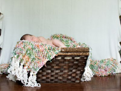 Sara, sorry it's taken me so long to address this.
If you really want to blur it, then you'll need to follow the cloning/blurring method in the Fake depth-of-field method I described recently.
However, for something like this, I find it easier to simply replace the background with a plain colour.
 Sara, sorry it's taken me so long to address this.
If you really want to blur it, then you'll need to follow the cloning/blurring method in the Fake depth-of-field method I described recently.
However, for something like this, I find it easier to simply replace the background with a plain colour.
Wednesday, June 9, 2010
Blurring a background (false DOF)
Every now and then we realise that a photo would have been nicer with a shallower depth of field. What to do?
I want to start by making something very clear - nothing you can do in Photoshop is as good as getting it right in camera. If at all possible, go back and take the shot again, with a wider aperture.
However, here is the method for achieving something vaguely satisfactory in Photoshop.
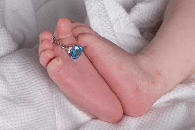
Thanks to Cristal for her permission to use this photo. It's beautiful, but she'd like the blanket blurred a bit.

Monday, June 7, 2010
Minimising soft shadows
Back in March I showed a method for softening hard-edged shadows. It's a terrible job, but unavoidable sometimes. Hard-edged shadows are cast by something very close to the subject - a hat, or whatever.
This time, we'll take a look at another shadow problem, but not so severe. Soft-edged shadows are cast by something a bit further away, and are a little easier to fix. I want to state right up front that this is not a magic 100% fix. The goal is simply to lessen the strength of the shadow areas, so they are not so offensive.
Here's a wedding party photo taken under trees. Most of the subjects escaped the dappled shadows, but this guy on the end was right in harm's way.
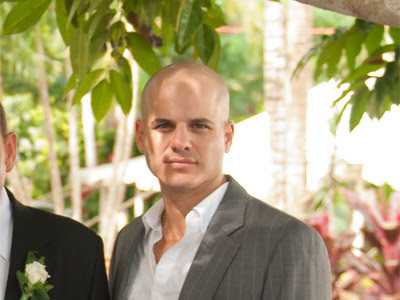
For something like this to be fixable, make sure you don't have any channel clipping in the skin! I can't stress this enough. Process the Raw photo a little underexposed if you have to, but just make sure you avoid any skin blowouts.
This time, we'll take a look at another shadow problem, but not so severe. Soft-edged shadows are cast by something a bit further away, and are a little easier to fix. I want to state right up front that this is not a magic 100% fix. The goal is simply to lessen the strength of the shadow areas, so they are not so offensive.
Here's a wedding party photo taken under trees. Most of the subjects escaped the dappled shadows, but this guy on the end was right in harm's way.

For something like this to be fixable, make sure you don't have any channel clipping in the skin! I can't stress this enough. Process the Raw photo a little underexposed if you have to, but just make sure you avoid any skin blowouts.
Sunday, May 30, 2010
Blending two exposures
To mark the 6-month anniversary of my ACL reconstruction, I asked my wife to take a few shots of me on the trampoline, demonstrating my renewed confidence in the ol' knee.
The down-low-looking-up composition made for some impressive captures, but there was a backlighting problem, of course.
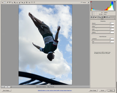
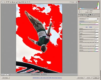
So it became fodder for this tutorial ... Processing and blending two exposures.
I began by processing the raw file twice - once where the sky was perfect, but I was too dark; and once where the sky was blown out, but I was just fine:


Saturday, May 29, 2010
Making PDFs from Photoshop
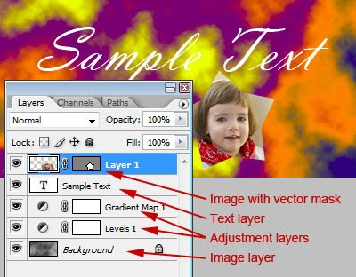
If you're using Photoshop to design an advertisement, or a flyer, or whatever, make sure you don't flatten the layers before you save the PDF.
The reason is that it's important to preserve text as vectors. Vectors are mathematical shapes which are infinitely re-sizable; as opposed to pixels which cause all sorts of problems when resizing, as we know.
Let's take a look at an example.
Here, I've prepared a simple file, with a mottled grey background, some adjustment layers, some text, and an additional image clipped with a vector mask:

Tuesday, May 25, 2010
Best practice for web photos
Question asked on a forum recently: "How do you optimize your picture for the web?"
Well, such a broad question is great fodder for a nerd like me, so I let rip with a longish reply ...
Well, there are a few vitally important things you need to do for your web images.
1. Make sure they are resized to the exact pixel dimensions required for the destination site/blog. If you upload them too big, the server (or browser) will resize them for you, and probably not do a very good job.
Web images are always sized in pixel dimensions. Some people will tell you that they have to be 72ppi - that's baloney. They can be a million ppi if you like. All that matters is the number of pixels. For example, all Facebook images should be 720 pixels on the longest edge (either wide or high). For another example, my blog requires images to be no greater than 590px wide. You'll need to interogate your own site/blog/whatever, and find out the exact required size.
Friday, May 21, 2010
Tiff files for printing
I received a question today - in a roundabout way - about using Tiff as a format for printing at a lab.
The correspondent shoots in Raw format, then edits and takes Tiff files to his lab for printing. Apparently, this particular lab needs Jpegs for their print process, so they convert his Tiffs to Jpegs before printing.
The correspondent's question was "Is Jpeg ok for printing, or should I be looking for a lab who can print Tiff files?"
I'll answer the second part of the question first. No, you needn't look for another lab just because your present lab can't print Tiff files. There are plenty of reasons you might need to switch labs (eg poor colour reproduction, inferior paper, slow turnaround, lousy customer service, etc) but file format certainly isn't one of them.
Sunday, May 16, 2010
Multiplicity
What do you do for kicks on a weekend? I beg my wife to set up her camera and tripod so I can have a bit of multiplicity fun!
"Multiplicity" is where you put yourself (or someone else) several times in the same photo. It's easy to do, and always makes people look twice! The best part is thinking up fun ideas - I have another one I'm itching to try out, but it will involve a trip to Ikea at some stage!
For this one, my wife took these three photos of me:
Wednesday, May 12, 2010
Grrrr ... banding!
Yesterday, on a forum, I saw a common lament. The member had a photo with a broad blue sky, and was complaining about the banding evident in it.
Banding is such a tricky beast, mainly because it's darn hard to tell whether it's genuinely in the image, or if it's just your screen. This makes you as nervous as hell, because you are wondering if it will occur in print.
As it happened, I couldn't see the banding on my screen in this particular photo that had been posted. This caused me to suspect that it was just the guy's screen that was showing a non-existent problem. I asked him for details of his monitor, and sure enough, it was a fairly cheap TN panel, which are prone to this kind of thing. (Ironically, it seems to occur more prominently in a calibrated screen than an uncalibrated one.)
Sunday, May 9, 2010
Critiquing sharpness
Asked on a forum today: "Can someone explain what determines a photo being too sharp, or not sharp enough?"
This is a great question!
Firstly, it's necessary to distinguish between "focus" and "sharpening". "Focus" is what happens in camera - eg when your lens really nails every single eyelash in a portrait. It's really not possible for an image to be "too well-focused". The better the focus, the better the result.
"Sharpening" is the artificial stuff we add after the event. If you shoot Jpeg, your camera might add some sharpening immediately after it captures the image. And you certainly get to add sharpening in post-processing when you get your images back to your computer. There are sharpening tools available in every imaging software, and the idea is to enhance the distinction of edges in the image, to make the focus seem even better than it was.
Saturday, May 8, 2010
Luminosity Selections
This is such a great tip, I can't believe I didn't think to write it before! Sorry Elements users, this one isn't for you.
A "Luminosity Selection" is the ability to make a selection based on the lightness/darkness of the tones in your image. The brighter the pixel, the more distinctly it's selected.
Up to Photoshop CS3, a luminosity selection was created by holding down Ctrl, Shift and Alt (Cmd-Shift-Option on Macs, I guess) and pressing the ~ key (that's the one at the top left of your keyboard). From CS4, it was changed to Ctrl-Shift-Alt-2 (not F2, just plain 2).
Friday, May 7, 2010
The lies they tell us in Kindergarten
I had this discussion with a trainee today, and it's worth sharing here.
We were adding saturation to a landscape photo, and the conversation turned to grass. Specifically, the fact that grass ain't green! Well, not always.
Almost as soon as we were old enough to hold a crayon, we were taught to draw green grass and blue skies (and houses where the windows are much higher than the doors, for some reason, but that's another matter!). But this isn't necessarily the case. Technically speaking, grass usually has a much stronger yellow component than green, and skies are invariably stronger in cyan than blue, unless a filter has been used in the capture.
To the average person, this doesn't matter a damn. And even to a photographer, it's not always a problem ... until you need to edit those elements. If you've ever used Hue/Saturation or Selective Color to adjust grass or a sky, you'll know what I'm talking about. If you choose "Greens" or "Blues" respectively, your adjustments tend to be weak at best. But if you look at the colours the way Photoshop looks at them, you'll realise that "Yellows" and "Cyans" are where the answer lies.
I guess there are dozens of examples of this. Green apples are another one that springs to mind - not green at all! So if you're having trouble editing a particular colour, stop for a moment and try to think like Photoshop - is it really the colour you think it is?
Tuesday, May 4, 2010
Printing big? Test small first
Getting a really big print done for the first time is as scary as hell, isn't it? It's really expensive, and you're afraid that you'll blow your dough because the shot isn't good enough, or your camera doesn't have enough megapixels.
First, I want to point you to my article here: How big can I print my photo? You'll find it puts your mind at ease.
Secondly, I want to talk about the practical solution - getting a small test print done first. Taking a small centre crop of the full-size image is a very cheap way to see how your large print will turn out.
Saturday, May 1, 2010
Jpegs in ACR
Photoshop version CS3 was significant for a number of reasons, one of which was the introduction of Jpeg editing in ACR.
I want to start with some clarification. Using ACR to edit Jpegs is really handy, if you're comfortable with the interface, the sliders, etc. An ACR workflow is slick and convenient once you know what you're doing.
BUT ... too many people mistakenly think they have all the benefits of Raw by editing their Jpegs this way. Not so. A Jpeg file is still just a Jpeg file - it doesn't have the enormous dynamic range of a raw file, nor the wonderful bit depth. As I've said before: "If I take my hatchback car to a luxury car dealership for a grease and oil change, it doesn't make it a luxury car - it's still a humble hatchback, with new grease and oil." If you truly want exquisite control over your images, you should shoot in Raw format.
Anyway, let's talk about editing Jpegs in ACR. It all begins in Bridge. If you're not using Bridge, I recommend it - it's a great program for browsing and previewing your images, not to mention all the other great functions.
Friday, April 23, 2010
Check your monitor's gamut
Once you've calibrated your monitor with a calibration device, you can check its gamut - that is, you can check the range of colour that it displays. You can compare it with the sRGB colour space, or Adobe RGB, or maybe the gamut of another calibrated monitor.
This might sound nerdy, and it is! But it can be interesting, too.
The cool way - in 3D!
If you have a Mac, this is available to you really easily, via the ColorSync Utility. You can view colour profiles in 3D, spin them around, etc. And you can compare the size and shape of two profiles. I've found some info about it here.
Thursday, April 22, 2010
And now for something completely different: Teach yourself handstand!
First, I need to apologise to all the folk who read this blog expecting the odd nugget of Photoshop wisdom. This post couldn't be further from Photoshop!
Second, and more important, I need to apologise to my mate Adam, who has been asking me since before Christmas for advice on teaching himself to do a handstand. Adam, I hope this is worth the wait! And who knows ... maybe somebody else out there would like to learn as well - it's never too late!
Second, and more important, I need to apologise to my mate Adam, who has been asking me since before Christmas for advice on teaching himself to do a handstand. Adam, I hope this is worth the wait! And who knows ... maybe somebody else out there would like to learn as well - it's never too late!
Friday, April 16, 2010
The Actions Palette
There's a real art to making, editing and managing actions, which you'll develop over time. I'd like to give you a brief tour of the palette, and discuss some simple methods of altering and personalising your actions.
(These screenshots have been taken in CS4, but there's very little difference in other versions. None of this applies to Elements, I'm afraid.)
If your Actions palette is in Button Mode, the first thing you need to do is choose the little flyout menu from the top corner, and turn off Button Mode:
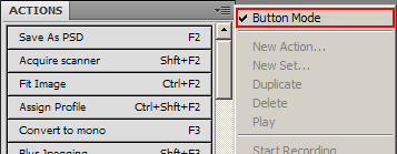 Then you'll see your actions in all their glory, like this:
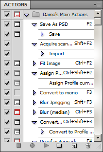
 Then you'll see your actions in all their glory, like this:

Thursday, April 15, 2010
Over-Rated Stuff: The Recovery Slider
Hi, and thanks for tuning in to this edition of Over-Rated Stuff, the show that looks at things that appear useful, but aren't very.
Last week we discussed inflatable dartboards, and this week we turn our attention to the darling of Adobe's raw processing programs, the Recovery Slider.
Watching somebody try to rescue blown highlights with the Recovery Slider is like watching a Hell's Angel biker trying to get drunk on low-alcohol beer. He drinks and drinks and drinks, and barely feels a thing.
Low-alcohol beer is what you politely sip at awkward formal occasions, and there's no chance of dancing the Nutbush with your underwear on your head. If you want to get rolling drunk, you need rum.
The Recovery slider is what you use to fix some tiny little pale areas in your photo. Let's be clear - if you have areas of blowout in your image, it's because of overexposure. And there's another slider that's used to fix exposure - can you guess what it is?
Sunday, April 4, 2010
An analogy
Here's something to ponder ...
If you have room for four passengers in your car, and have four spare tickets to a football game, is there any sense in inviting five of your neighbours to come with you?
Of course not.
Even if you could hide the fifth guy in the boot ("trunk" for my foreign friends) where he couldn't be seen, he wouldn't be able to get in to the game without a ticket anyway.
Now, consider this ...
If your computer screen can display colours no brighter than the sRGB gamut, and your lab can't print colours brighter than the sRGB gamut, is there any sense in processing your images in the Adobe RGB or ProPhoto RGB space?
Of course not.
If you can't see those extra colours, or reproduce them, there's no sense in "inviting" them along in the first place.
Tuesday, March 30, 2010
White balance
When you're shooting, you can leave your camera on Auto White Balance, or you can choose one of the WB presets in your camera, or you can do a Custom WB using a grey card. In each case, it may or may not be necessary to make further WB adjustments to your Raw files once you get back to your computer.
I have no opinion about your white balance method - do whatever suits you.
All I wanted to mention is that there is no difference to the quality of your Raw data, no matter which method you choose. Whether you use CWB and get it exactly right, or AWB and get it wildly wrong, and have to correct it later, the end result is exactly the same.
Your camera captures a finite amount of data on its red, green and blue sensors; and that data is set in stone. The white balance setting is merely an additional piece of information which is used to interpret the Raw data.
So choose the white balance method which suits your own workflow, and be happy in the knowledge that you aren't making any difference to the quality of your Raw files.
Wednesday, March 24, 2010
The non-destructive workflow
The layer-based non-destructive workflow is seen to be the goal of the skilled Photoshop operator. In truth, it is sometimes difficult to achieve for every image, but a lot of the time a non-destructive workflow is possible, and powerful. I would like to explain it in very broad terms here. (Wiser folk than me have written wiser words than mine, so I would encourage you to search for further information if this overview sparks your interest.)
I'll begin by saying I don't like the term "non-destructive workflow". To speak of "destruction" makes it sound like something catastrophic is going to happen to our image! Of course that's not so. And I simply think that it is not an apt description for the intent of the workflow, which is to allow us to infinitely re-edit our image as we see fit. The power to change our minds about any of our previous adjustments, without having to start all over.
I would prefer the tag "reversible workflow" or "flexible editing" or something like that. However, for the sake of simplicity, I'll persevere with the title of "non-destructive editing" for this post.
Tuesday, March 23, 2010
A tip for watermarking
This article has been removed, because it has been superseded by this: http://www.damiensymonds.com.au/act_web.html
Sunday, March 21, 2010
Screen and Soft Light blend modes
A friend wrote to me and asked my opinion on the use of Screen and Soft Light layer blend modes for editing. Not surprisingly, I have an opinion, and a firm one.
Screen mode is habitually used to lighten an image (or part thereof), and Soft Light mode to add midtone contrast.
I don't consider them terrible. Neither one introduces channel clipping, so they're certainly not dangerous; so if you like using them, I can't rightly stop you.
However, I find them very clumsy and arbitrary, and they don't provide as much control as alternative methods.
Wednesday, March 17, 2010
Softening hard shadows - Method 1
Many thanks to the lovely Merisa Coertze for allowing me to use her photo for this demonstration.
Here we have a cute photo of boys being boys. And bright sun being bright sun, there are some very hard shadows on various parts of the photo.
 Photoshop gives us dozens of ways to perform any task, of course, so here is just one method for softening these shadows a little.
 Photoshop gives us dozens of ways to perform any task, of course, so here is just one method for softening these shadows a little.
Sunday, March 14, 2010
Using Noiseware Community Edition
Noiseware Community Edition is a handy free noise removal program from Imagenomic. It's available for download on this page (the very last link). Unfortunately it only works on PC, which is disappointing for Mac users, but Imagenomic's other products are cross-platform.
The Community Edition is a standalone program, which means a bit of fiddling in your workflow, because you have to leave Photoshop, run the noise removal, then return to Photoshop. If you do a lot of noise removal, you'll probably find it worthwhile to pay for one of the Photoshop plug-in versions (available on the same page).
Noise removal can be done at any (chronological) point in a non-destructive workflow - you can do it first, or last, or in between. What's important is that it's done on a layer immediately above the Background layer, underneath all of your adjustment layers.
For this tutorial, I will discuss using Noiseware as the very first step in the Photoshop workflow.
Of course, this tutorial only applies for jpeg files. If you shoot raw (and you SHOULD) use the noise removal sliders in your raw program.
Damn you, Dynamic Contrast!
Today I was calibrating a Samsung monitor for a lovely lady here in Brisbane. I ran the calibration/profiling, and was immensely satisfied with the result graphs that the i1 provides at the end of the process. Thinking all was well, we proceeded with some Photoshop work.
I was appalled to see the first black-and-white image that we opened - it looked strangely pink! And the next one was, too. And some colour images had a less-than-perfect hue to them as well.
Wednesday, March 10, 2010
Calibration "before-and-after" confusion
At the end of a monitor calibration, most calibrators allow you to see "before and after". The two states are often very different - eg very cool vs quite warm, or whatever.
Some people mistakenly think that this is comparing the previous calibration with the new one. Because the difference is so great, it makes people say "Gee, I should have calibrated sooner! It was way off!!"
Relax. What that before-and-after is showing you is the new monitor profile vs the completely unprofiled state. It's not comparing last month's calibration with this month's calibration.
The truth is, modern monitors don't drift much, and there will be very little (if any) visible difference between monitor profiles from month to month. If you accidentally let your calibration go for two or three months, you shouldn't be doing your images much damage, if any. In the old days of CRTs, it was a different story - those things drifted like rafts.
However, I hasten to add - if you're doing work that requires a critical level of colour accuracy, you'd be careless not to calibrate quite frequently, just to be sure.
Sunday, March 7, 2010
A bit about soft-proofing
What is soft-proofing?
It's how we can see what our prints will look like, before we print them, by simulating the print colours in Photoshop. (I'm not sure if Elements can soft-proof, and I don't know about other software either. I'll just be talking about Photoshop here.)
How accurate is it?
If it's done well, it should be very accurate. There are a few factors which can cause variance (not least of all the ambient lighting in which you work), but as long as you have a little tolerance, it will serve you well.
When should you soft-proof?
I guess, strictly speaking, you should do it every time we prepare an image for print. But in reality, it's only important when an image has bright colours that you suspect might be too bright to print ("out of gamut"). After you've used your monitor and your lab for a while, you'll get an instinct for the "endangered" colours.
Saturday, March 6, 2010
Great little disk cataloguer for PC
Eventually, all my files end up archived on DVDs. A few years ago I was laboriously typing summaries of each disk into an Excel document, so that I could find files again if I needed them. What a hassle!
Then I came across a terrific little app called "Cathy". It's a free download from the developer's site here (towards the bottom of the page).
It's simple, fast disk cataloging software. Immediately you burn a disk, you just run it through Cathy, and she takes a comprehensive record of all the files on the disk, and adds it to her library.
Then, it's super-simple to search the catalogue for keywords, or dates, or whatever, and Cathy shows you which disk/s contain your files.
If you don't have a system like this to track your archives, I strongly recommend one.
Friday, February 26, 2010
16-bit to 8-bit
I mentioned this in passing on a forum today, and wanted to elaborate a little.
If you choose to edit your images in 16-bit mode, then of course you need to convert to 8-bit for printing at the end.
Your final steps for printing probably include:
> Flatten layers
> Crop/resize
> Convert to 8-bit
> Sharpen
> Save
Now, the order of some of those steps is flexible. You could resize before flattening, for example. Some people say it's important to sharpen while still in 16-bit, and they're probably right (I haven't checked).
Wednesday, February 24, 2010
Skintones - why so hasty?
I'd like to take this opportunity to ask your advice about a few things, if I may ...
My son is seven months old, and crawling a little. Do you think he's ready for me to take him to the park and teach him to fly a kite?
My daughter is two and a half, and learning the alphabet. She knows most letters by sight, and knows some of their sounds. Is this an appropriate time for us to introduce her to the works of Shakespeare?
Our bathroom is quite old and daggy (circa 1970s) and we hope to renovate it in the next few years. Would now be a good time to install some gold-plated fixtures?
The answer to all three questions is clearly "No".
Ok, what about this question ...
I have a photo that's a little bit underexposed, and I haven't fixed the white balance. Should I go ahead and try to fix the skintones right away?
Too many people, it seems, would answer "Yes, go ahead" to that question.
So often I see people agonising over skintones, when it is crystal clear that the photos have overall exposure and white balance issues.
Please, pleeeeeaase slow down and evaluate your photo. Good white balance and good exposure will take you most of the way to good skintones. Look after the big things, and the little things will look after themselves.
If you dive right in there and start trying to fix skintones, without fixing the whole photo first, you'll drive yourself insane.
Monday, February 22, 2010
What makes a great black-and-white photo?
Black-and-white imaging is tricky - if it's done well, it looks amazing; but if it's done poorly it looks awful.
So what's the key to a good one? Well, it's right there in the name - black and white.
The name of the craft is not "Shades-of-dark-grey-and-light-grey photography". It's "Black-and-white photography".
For a B-W photo to smack the viewer in the face, it needs to have plenty of blacks and whites. Any area of significant detail without a black and a white in it somewhere is flat, dull, and uninspiring. The photo needs plenty of contrast, not only globally, but in all the detail.
Wednesday, February 17, 2010
Multiple light sources ... AAAAAAAAGGHH!!!!
What's your worst enemy in post-processing? Noise? Nope. Underexposure? Nah.
It's multiple light sources! I hate them so much!!!!!
Well, let me clarify. You can take a photo with as many light sources as you like, as long as they're exactly the same temperature. But if you have a photo with two or more sources of different coloured light, it's a nightmare to edit.
Usually the problem arises in photos which are taken indoors, with an overhead light and a window providing the illumination. The bulb light is quite yellow, and the natural light is bluer by comparison. If both the warm light and the cool light are striking the subject's face, it's bloody awful to try to balance.
I'd rather edit an underexposed, noisy, yellow photo over a perfectly-exposed, clean photo with two light temperatures. One white balance problem is easy to fix; more than one in the same photo is very difficult.
So, make things easy for yourself. You can shoot in natural light, or fluorescent light, or tungsten light, or whatever ... just make sure there's only one light temperature. You'll save yourself plenty of headaches back at the computer.
Monday, February 15, 2010
Itty bitty tips for PS on PC
PC Photoshoppers, did you know ...
1. Simply double-clicking on the grey background of the Photoshop workspace will bring up the File > Open dialog? Quicker than reaching for the menu, or even Ctrl O.
2. Ctrl-Tab will toggle through your open images? Actually, this is true for other applications as well ... while Alt-Tab toggles between applications, Ctrl-Tab toggles between documents within an application.
These two shortcuts might not seem like much, but if they can save you a few seconds every few minutes, it all adds up to a quicker workflow.
When I was a young bloke, the first time I worked at a newspaper, a wise old tradesman gave me an excellent tip. He said (paraphrasing): "Shortcuts will improve your work, but don't try to learn them all at once. Pick one or two each week, and build them into your workflow. For the first few days they'll feel slow and unintuitive, but by the end of the week they'll be as natural as breathing."
He was dead right. Little by little I've trained myself in heaps of keyboard shortcuts in all of the Adobe programs, and I do them instinctively, without even really knowing what my fingers are doing.
Saturday, February 13, 2010
Video tute: B/W conversion action
Here is my first attempt at a video tutorial ... I hope the quality is ok!
I've shared my black-and-white conversion action on my site here. It's very simple, and fairly self-explanatory.
I've recorded a brief video to demonstrate it. I hope you find this useful.
Sunday, February 7, 2010
Multiple images in one PSD
This post is following up a discussion I had, which was following up my Trash those Jpegs article. Unfortunately, this won't work too well in Elements, which doesn't have Layer Groups, as far as I'm aware. Please correct me if I'm wrong.
Sometimes you might have processed an image a few different ways - eg once in "clean" colour, once as black-and-white, and once as a Vintage colour.
Normally, you'd expect to have one file for each of those styles. This places additional burden on your hard drive space, of course.
But with a proper layer-based workflow, it should be entirely possible to use the one PSD to house all of those styles. I do it simply by grouping my adjustment layers together and naming them appropriately.
Let's take a look at an example ...
Here's an unprocessed image:
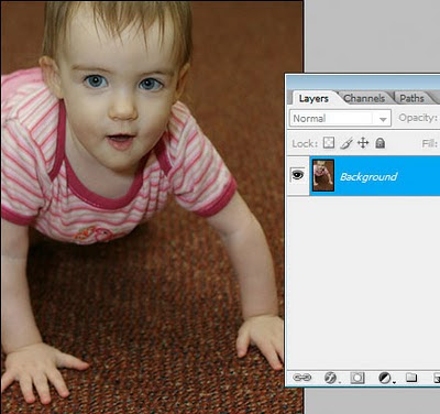 First thing I do is my normal "clean" processing, using a few simple adjustments:
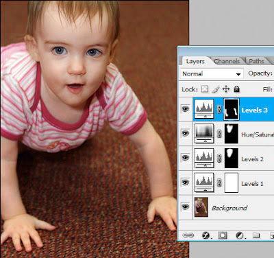 I'll group those adjustment layers together, and call the group "Enhancements".
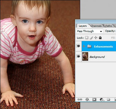 Hmmm ... what next? I think this might look good in black-and-white. I'll convert and make a few additional adjustments as required:
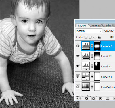 And again, I'll group those layers into their own group:
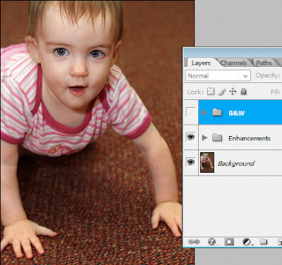
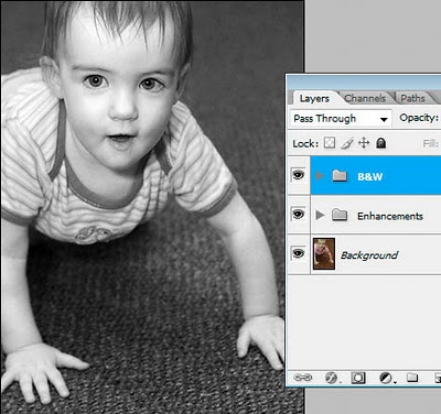 Now I'll simply hide that B&W layer. Now I'm back to my colour image. You can see how this is much easier than closing down the black-and-white one, and re-opening the colour one. It's all in one file!
 So, I'll keep going. I'll try a kinda "grungy" style ...
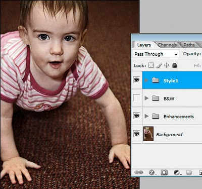 ... then turn that off and try a "burned colour" sort of style:
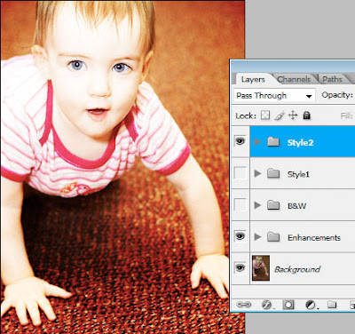 So I hope you can see the advantages to this. As you know, adjustment layers add almost nothing to file size - they are tiny. The only layers that add significant file size are pixel layers - ie my Background layer. If I had saved four different PSD versions of this image - one clean colour, one black-and-white, one grungy and one burned colour - then I would have been saving that big Background layer onto my hard drive four times. This way, I'm only saving it once.
More food for thought :)
 First thing I do is my normal "clean" processing, using a few simple adjustments:
 I'll group those adjustment layers together, and call the group "Enhancements".
 Hmmm ... what next? I think this might look good in black-and-white. I'll convert and make a few additional adjustments as required:
 And again, I'll group those layers into their own group:
 Now I'll simply hide that B&W layer. Now I'm back to my colour image. You can see how this is much easier than closing down the black-and-white one, and re-opening the colour one. It's all in one file!
 So, I'll keep going. I'll try a kinda "grungy" style ...
 ... then turn that off and try a "burned colour" sort of style:
 So I hope you can see the advantages to this. As you know, adjustment layers add almost nothing to file size - they are tiny. The only layers that add significant file size are pixel layers - ie my Background layer. If I had saved four different PSD versions of this image - one clean colour, one black-and-white, one grungy and one burned colour - then I would have been saving that big Background layer onto my hard drive four times. This way, I'm only saving it once.
More food for thought :)
Friday, February 5, 2010
Editing skintones in Photoshop Elements
A lady wrote to me today to ask my advice about editing skintones in Photoshop Elements.
Her problem is shared by all Elements users - namely, the absence of CMYK numbers in the Info Palette. There are lots of tutorials on the web about editing skintones, but most of them advise doing it by the CMYK values. You know the kind of thing - "Cyan 1/3 of Magenta, Yellow slightly higher, etc".
How do you edit "by the numbers" if you don't have the numbers?
Well, the first answer is "by looking at the photo!" This might seem flippant, but seriously, it's possible to get so bogged down in "technical this" and "percentage that" that you forget to just look.
If your instinct says "that guy is too rosy" or "healthy people don't look as grey as that" or "she's too dark" or whatever, then that's what counts. Are people going to hang a little Info Palette beside your photo on their living room wall? Of course not. (Actually, that would be pretty funny!)
But, despite all that, I'm aware of the value of numbers. It's easy to start second-guessing yourself on skintones, and it's certainly easy to over-process and get lost in a mess of adjustments, and start to go insane. It's great to have numbers that you can check.
So, are Elements users doomed to insanity? No, of course not. You've got numbers - RGB ones.
RGB numbers aren't too hard to get used to. Broadly speaking, the rule is pretty simple: R>G>B. The Red value will always be higher than the Green value, which in turn will be higher than the Blue value.
Let's get a bit more specific. The Red value will usually roam between the mid-100s (in shadow areas) to mid-200s (in highlight areas).
The Green and Blue channels will usually roam from just under 100 to just over 200. What's important is the margin. The Green value will be an average of 20-30 points higher than the Blue value. If you keep that approximate margin, the colour of the skin will look good.
Please note that I'm talking about sRGB numbers here. If you consider yourself advanced enough to use Adobe RGB or ProPhoto RGB, then I would expect you to already be very proficient with skintones, and you don't need my help.
So don't despair that you can't afford a full version of Photoshop; and please don't think that you can't achieve great photos and great skintones in Elements. It's a powerful tool, and with a little practice, you'll be able to adapt CMYK-centric tutorials for your purposes.
Lastly, I want to say that people who truly understand how the R, G and B channels interact to make colour will become masters of their craft. CMYK numbers are not "real" values, and in the long run, will teach you very little about digital colour.
Please take a moment to read my Ramblings about skin, where you'll find some more useful information.
Thursday, February 4, 2010
Trash those Jpegs!
Some of you would have seen this when I posted on a forum today. But it's great blog fodder, so I can't pass up the opportunity to post it here as well!
There have been a few questions about workflow and file formats lately, so I'd like to share some thoughts here.
I'm going to make a suggestion about workflow. But please understand that there are as many workflows as photographers, and the one that's right for you is the one that works for you. Feel free to embrace, adapt or ignore as you please.
This is a Photoshop-based workflow. I don't use Lightroom, and I refuse to do so until they fix the colour space issues. Anyway ...
Part 1. The camera file
Whether you shoot Raw or Jpeg is immaterial. If you shoot Jpeg, you can open your image directly into Photoshop. If you shoot Raw, it goes through ACR first. Either way, it ends up in Photoshop.
Your camera file (Raw or Jpeg) is the precious original. You work from it, but you don't delete or change it.
Part 2. The PSD
Once the image is in Photoshop, the first thing you do is "Save As" and save it as a PSD file. A Tiff file is fine too (I use PSD because it's the easy default, and I'm lazy, and I see no reason to do otherwise).
PSD and Tiff are the Great Almighty File Formats. They can be high bit, have layers, have extra channels, etc. They're big (because there's no compression) but they're beautiful.
Part 3. The editing
Ok, so you go ahead and do your thing. Edit however you please (layers, actions, whatever) and save frequently. As you know, I do not recommend cropping, resizing or sharpening this master file in any way.
Part 4. The archiving
Once you've created your masterpiece, you back it up, archive it, and keep it forever. You might choose hard drives, or DVDs, or online storage ... it doesn't matter. The point is, you keep your magnificent work of photographic art safe for the rest of your days.
As well as that PSD, you can also archive your original camera file. Well, you don't have to, I guess, but it's probably not a bad idea.
Ok, so that's the whole workflow, from camera file to archive. A lovely straight road to follow.
But what about output, Damien? I don't edit my photos just to archive them. I want to print them, or show them on the web.
This is where we come to "Disposable Jpegs".
After you've created your PSD masterpiece, it needs to be saved as a Jpeg for any form of output. All photos for the web need to be Jpegs, and while there's a few labs who will print PSDs, most will expect Jpegs.
So, you flatten the layers in your PSD, crop/resize and sharpen appropriately for the intended output, then save as a Jpeg. Then you upload your Jpeg - to your server if it's a web image, or to the lab if it's a print. (Or maybe it's going on a CD for a client). Once you've uploaded it ...
... DELETE IT.
There is very little point to keeping these Jpeg output files. They're just annoying little files that clutter up your hard drive. If you need another Jpeg tomorrow, just make it again from the PSD.
I know for a fact that a lot of people are keeping Jpeg copies of their files all over the place. I encourage you to take a look at your workflow and ask yourself "do I really need to keep this Jpeg file?" You might well find that the answer is "Um ... actually, no."
Food for thought.
Wednesday, February 3, 2010
Please ignore your monitor profile
You buy a monitor calibration device. You calibrate your monitor. Then what?
Nothing.
Not a thing. The monitor profile just sits deep in your operating system, where Photoshop and your other colour-managed programs know where to find it and refer to it. As the owner of the computer, your only task is to recalibrate regularly to make sure the profile is up-to-date.
Too many people get into trouble by setting their monitor profile as their Working Space, or assigning it to their images, or soft-proofing with it. None of those things are necessary, and all of those thing will end in tears.
Just leave it alone!
That is all.
Sunday, January 31, 2010
Channel mixer to fix a sun flare
I had to fix this photo today:
 A gorgeous shot, but there's an unfortunate red sun flare very prominent.
Luckily, it was a very easy fix, which I thought I'd share here.
This is a job for Channel Mixer. I suspect a lot of people have only used Channel Mixer for black-and-white conversions, if they've used it at all. But this kind of problem is just what Channel Mixer was born for.
Here's a closer look at the area:
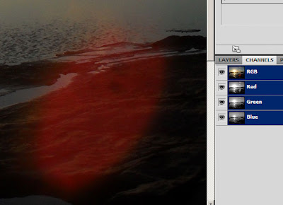 First thing I needed to do was examine the individual channels, to see where the damage was.
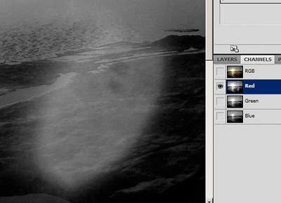
Here's the Red Channel. You can see it's cactus:
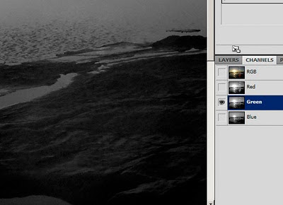
 Here's the Green Channel. It's looking really good:
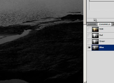
 Here's the Blue Channel. It's also looking pretty good, but the poor old Blue Channel is always the grainiest of the three, so it's not ideal:
 So, what I needed to do was simply replace the Red Channel with the Green Channel in the problem area.
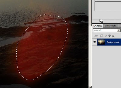
To begin, I made a rough selection of the area. I used Quick Mask, but Lasso would have been ok as well:
 Then I made a Channel Mixer Adjustment Layer. Immediately, of course, my "marching ants" selection was replaced by the layer mask. Channel Mixer opens on Red as the default Output Channel, which was perfect for my needs, because the Red Channel is the one I wanted to fix:
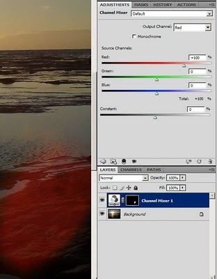 To swap a channel is ridiculously simple. I just reduced the Red slider to 0%, and increased the Green slider to 100%. By doing this, I told Photoshop I wanted the red data to be completely replaced by green data on the target output channel. Take a look at the result:
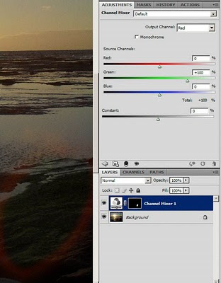 Obviously, I could now see that my mask wasn't entirely accurate, because there was a red halo around my adjustment. So I carefully painted my mask to ensure all the redness was gone:
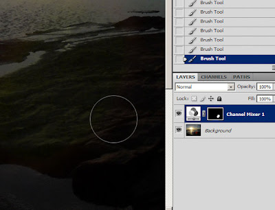 Piece of cake!
To be honest, sun flares are rarely this easy. Usually it's necessary to adjust two channels, or even all three, and even then there's cloning to be done, or further colour correction. I was lucky that this one was so easy!
 A gorgeous shot, but there's an unfortunate red sun flare very prominent.
Luckily, it was a very easy fix, which I thought I'd share here.
This is a job for Channel Mixer. I suspect a lot of people have only used Channel Mixer for black-and-white conversions, if they've used it at all. But this kind of problem is just what Channel Mixer was born for.
Here's a closer look at the area:
 First thing I needed to do was examine the individual channels, to see where the damage was.
Here's the Red Channel. You can see it's cactus:
 Here's the Green Channel. It's looking really good:
 Here's the Blue Channel. It's also looking pretty good, but the poor old Blue Channel is always the grainiest of the three, so it's not ideal:
 So, what I needed to do was simply replace the Red Channel with the Green Channel in the problem area.
To begin, I made a rough selection of the area. I used Quick Mask, but Lasso would have been ok as well:
 Then I made a Channel Mixer Adjustment Layer. Immediately, of course, my "marching ants" selection was replaced by the layer mask. Channel Mixer opens on Red as the default Output Channel, which was perfect for my needs, because the Red Channel is the one I wanted to fix:
 To swap a channel is ridiculously simple. I just reduced the Red slider to 0%, and increased the Green slider to 100%. By doing this, I told Photoshop I wanted the red data to be completely replaced by green data on the target output channel. Take a look at the result:
 Obviously, I could now see that my mask wasn't entirely accurate, because there was a red halo around my adjustment. So I carefully painted my mask to ensure all the redness was gone:
 Piece of cake!
To be honest, sun flares are rarely this easy. Usually it's necessary to adjust two channels, or even all three, and even then there's cloning to be done, or further colour correction. I was lucky that this one was so easy!
Subscribe to:
Posts (Atom)
Comments or Questions?
If you have anything to add or ask about this article, please visit me at my Ask Damien page.


